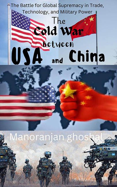
If a book cover could start a diplomatic incident, this one would already be standing trial at The Hague.
The Cold War Between USA and China doesn’t so much illustrate global conflict as it does wage war on graphic design itself. We’re talking a multi-front disaster where fonts, images, and layout choices have all simultaneously surrendered.
Let’s start with the font situation—because it’s a situation. This cover uses more mismatched fonts than a ransom note. “Cold War” gets some wannabe stencil grunge treatment, “USA” and “China” are written in what looks like the font you’d find on a rejected bubble tea label, and the subtitle is… somewhere in there, just vibing with no sense of alignment or hierarchy.
Then there’s the flag-palooza. One image has two actual flags on poles waving dramatically (read: stock photo #1). Another section showcases a literal red fist clenching a star mid-punch with a folded American flag-hand reaching back. Symbolism? Maybe. Cohesion? Absolutely not. These images are slapped together like a last-minute collage project from a conspiracy theorist’s scrapbook.
But wait—there’s more. The bottom panel is a military fever dream: mechs, drones, or some off-brand Transformers walking across a scorched earth battlefield. Why? What genre even is this anymore? Political thriller? Dystopian sci-fi? Illustrated infomercial?
Let’s not overlook the name “Manoranjan ghoshal,” which has been quietly camouflaged into the image like it’s trying not to be associated with its own cover. A gentle reminder: readability is not optional.
This is not a thematic design—it’s three separate political cartoons who took the wrong Zoom link and ended up on the same book cover.
Final analysis? This cover is a cautionary tale in composition, font misuse, stock photo abuse, and general aesthetic warfare.
If graphic design is your passion, this book cover is your villain origin story.
