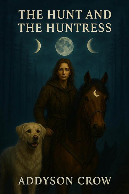
Deep in the twilight woods of design misfires, where logic goes to hibernate and horses glow under invisible lights, we find “The Hunt and the Huntress” — and oh, what a hunt it is.
Let’s set the scene: a mysterious woman on horseback, her trusty golden retriever by her side, and three moons levitating behind them in what appears to be a sci-fi spiritual forest temple of lunar confusion. If you think that sentence was chaotic, just wait until we dissect this cover.
Let There Be (Inconsistent) Light
The moon trio (yes, three moons — apparently astronomy went polyamorous) hovers directly behind the characters, and yet, miraculously, they’re all lit from the front. Maybe the real magic in this book is the omnipresent, invisible ring light following them through the forest.
The dog is glowing. The woman is glowing. The horse is glowing. And none of the light is coming from behind them. Physics? Never met her.
The Dog Is Either Majestic or Mutated
Our loyal pupper pal is somehow towering up past saddle height. Either it’s standing on a log we can’t see, or this is the Shaquille O’Neal of retrievers, bred specifically for forest domination. There’s also a strange shadow cast across the horse’s leg — from the dog? From a misplaced object in Photoshop? No one knows. Not even the cover designer.
The Lunar Tattoo That Wasn’t
Ah, the crescent moon delicately placed on the horse’s forehead. But wait — it’s not painted, blended, or embossed. It’s plastered, like a kid’s sticker slapped on a school notebook. The lighting doesn’t match, there’s no fur texture showing through, and it floats eerily like a temporary tattoo made by an AI with no sense of subtlety.
That Weird Neck Thing
There’s a smudge or shadow on the woman’s neck that looks suspiciously like someone tried to clone-stamp away a watermark and gave up halfway through. Either that or a ghost tried to choke her mid-shoot and Photoshop captured the moment.
Typography Crimes
No font hierarchy. No flair. No soul. The same font is used for the title and the author’s name — same weight, same style, same center alignment. This isn’t elegant minimalism; this is “I found this font on Canva and never looked back.”
Fogged Up and Checked Out
The entire forest background is enveloped in fog. But don’t worry — the fog doesn’t dare touch the moons, which float in pristine HD glory like celestial AirPods. It’s like someone dragged a blur brush across everything but forgot to mask the sky.
And Now, for the Lunar Showstopper
Waxing. Waning. Full. All at once.
Is this a fantasy world with a tri-lunar system? No — it’s a one-liner for bad astronomy memes. Someone googled “cool moon phases” and threw them up like a buffet of celestial nonsense. Neil deGrasse Tyson would walk off the set.
Honorable Mention: A Glorious Glow-Up
But here’s the twist in this moonlit melodrama: Addyson Crow came back swinging. A new edition of The Hunt and the Huntress was released with a completely redesigned cover, and let’s just say it’s giving full “graphic design is my passion — and also my skillset now.”
Elegant composition? Check.
Consistent lighting? Check.
Professional polish? Check.
Font hierarchy? CHECK.
It’s everything this original cover wanted to be, but finally howled into reality.
Final Verdict?
The original cover stumbles through the woods like it missed every design checkpoint and got bit by a radioactive moonbeam. But the author’s upgrade is a masterclass in learning, evolving, and absolutely sticking the landing on the second try.
So, while this roast was well-earned…
Bravo, Addyson. You hunted down a better design — and caught it.
