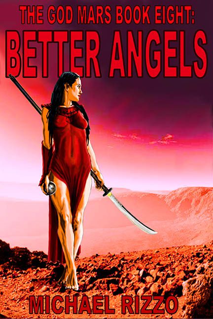
There’s something almost poetic about the title Better Angels—because the only thing divine on this cover is the level of chaos. This is not a book cover. This is what happens when your sci-fi dream collides with a 2005 desktop background and loses.
Let’s begin with our heroine, who appears to have wandered off the set of a Red Sonja reboot and onto Mars. She’s rocking a high-slit red nightgown that looks like it was attacked by garden shears, while holding a katana and a silver orb, because of course she is. Why choose a weapon when you can accessorize like a Final Fantasy character caught in a live-action fan film?
Her pose says “noble warrior queen,” but her feet say “I’m deeply confused by the terrain.” She’s not so much standing on Mars as she is awkwardly layered above it, like a sticker placed onto a child’s science project. The lighting? Incompatible. The shadows? Missing. The aura? Unhinged.
Behind her, Mars is rendered in a vivid nightmare of crimson gradients. The sky bleeds pink into purple like a radioactive smoothie, while the rocky foreground competes with her dress in a who wore red worse contest. There’s no depth. No atmosphere. Just a swirling cauldron of red tones turning your eyeballs into raisins.
And now, the typography, because if there’s one thing this cover is more passionate about than red, it’s yelling. The title “BETTER ANGELS” is stamped across the top in all caps, in a firetruck-red block font that looks like it was downloaded from a free font site called “Apocalypse Poster Bold.” Above it, “THE GOD MARS BOOK EIGHT” just in case you forgot this was part of a very subtle saga. This text is not designed—it’s deployed.
At the bottom, “MICHAEL RIZZO” gets the same treatment—bright red, blocky, ungraceful—like a branding iron for your retinas.
There is zero visual harmony. Everything is fighting everything else. The woman clashes with the background. The background clashes with the font. The sword clashes with logic. If there was a color theory involved here, it got lost somewhere between “Mars” and “What if the sun exploded?”
And don’t get me wrong—pulp sci-fi cheese has its charm. Done right, it’s glorious. This? This is pulp that’s been left in the heat too long, melted into abstraction, and molded into the shape of a warrior woman who is absolutely going to roll her ankle on those Martian rocks.
In the grand arena of terrible covers, Better Angels is a glowing red monument to every design instinct that said “more… louder… redder.” It’s not just God Mars Book Eight. It’s Graphic Design’s Final Warning.
Someone, please—send better angels. Preferably with a budget.
