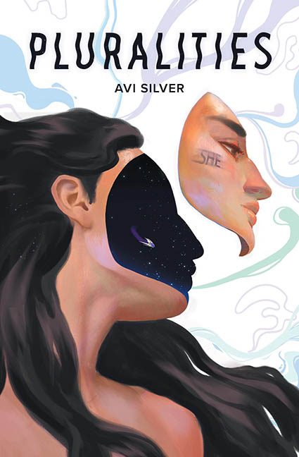
Every once in a while, a cover comes along that teeters on the very edge of acceptability — a cosmic seesaw balanced between bold artistic ambition and graphic design confusion. Pluralities by Avi Silver sits right there, dangling one leg over the pit of Horrible Covers, and with a subtle cosmic nudge… it tips.
Let’s start with the concept: it wants to be brilliant. Surrealism? Check. Cosmic metaphor? Absolutely. A person’s face floating away to reveal the star-filled void within? Love that for you. But this isn’t design brilliance. This is digital existentialism rendered with a brush set from an iPad drawing app and no second draft.
At first glance, this looks promising. At second glance, you start asking questions like:
-
“Why is the space bleeding into the hairline like a rogue galaxy escaped the mask layer?”
-
“Is that a spaceship, a whale, or an unidentified flying sock?”
-
“Why does the word ‘SHE’ look like it was rubber-stamped onto a mannequin’s cheek with zero curvature?”
-
“And why does the neck and shoulder area look like it was speed-painted during a lunch break?”
Let’s talk about that mysterious floating object. It’s smack-dab in the middle of the inner starfield — clearly meant to be something. Unfortunately, it has the definition of a smudge and the visual clarity of a sneeze on glass. This isn’t symbolism — this is confusion orbiting a missed opportunity.
The cosmic cutout effect could have been haunting and beautiful… if only the mask didn’t leak into the hair at the back of the head. It’s the digital art equivalent of coloring outside the lines and pretending it’s part of the vibe. Spoiler: it’s not.
Then there’s the illustration itself — and here’s where things really start to unravel. The facial rendering? Solid. The hair? Stylized and confident. But then the torso enters stage left like a different artist took over with a watercolor brush on low opacity and said, “We’ll finish the rest later.” It’s under-rendered and oddly flat, completely betraying the effort put into the upper half. The swirly background elements? Generic, disconnected, and vaguely aquatic. They don’t support the composition — they’re just there.
Typography, to its credit, is the one thing holding on for dear life. The title font is modern and stylized enough to feel intentional. The author name is fine — small and legible. But even here, nothing elevates the design. It’s a frame around a painting that doesn’t quite know what it’s trying to be.
In the end, Pluralities isn’t a trainwreck. It’s not screaming for help. But it absolutely earns its spot in the “almost great, but ultimately horrible” category. It’s the kind of cover you’d admire at thumbnail size, then slowly back away from as the details reveal themselves like an off-brand Salvador Dalí print.
Ambitious? Yes.
Professional? Not quite.
Horrible? Just enough.
And that’s how this one gently slides into the Horrible Covers collection — not with a crash, but with a wistful, cosmic plop.
