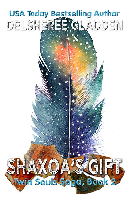
Some covers whisper mystery. Some scream adventure. Shaxoa’s Gift does neither — it just awkwardly flaps a watercolor feather at you and hopes you’ll mistake confusion for cosmic significance.
Let’s start with the centerpiece: the feather. It’s big. It’s colorful. It’s… weirdly cosmic? Starry? Possibly sentient? We don’t know. What we do know is that it’s floating above a pile of what appears to be rusty pottery shards or broken terracotta armor, and the two elements could not be less interested in being on the same cover together.
The feather screams “digital watercolor download from a design bundle.” The debris underneath it looks like someone Googled “texture with earth tones” and dragged it in without asking questions. There’s no depth, no shadow logic, no attempt to make the two elements relate. It’s like a spiritual object landed gently onto a pile of dirty dishes.
And then — then! — the fonts arrive.
Like uninvited guests at a backyard barbecue, they all show up wearing the wrong vibe and shouting over each other.
-
“SHAXOA’S GIFT” is the main offender, styled in a gritty, scratched-up font that says “post-apocalyptic biker memoir,” not “mystical fantasy saga involving feathers and feelings.” The white embossing tries to give it authority, but instead gives it the texture of a crusty sidewalk stencil.
-
Right underneath, “Twin Souls Saga, Book 2” enters in cheery teal sans-serif like it just got back from designing a preschool website. Bold, bright, and deeply mismatched with every other part of the cover.
-
At the top, “USA Today Bestselling Author” and the author’s name appear in basic serif fonts with drop shadows, embossed to within an inch of readability. It’s giving WordArt with ambition.
Each typeface looks like it came from a different Canva template, and none of them got the memo about consistency. Together, they form a clashing symphony of style indecision, battling it out over a white background that offers no cohesion, no grounding, and no escape.
And let’s talk tone. What is this book? The title is mysterious. The feather is magical. The subtitle sounds like paranormal romance. The font says dystopian spray paint. The overall effect?
Genre salad. With sparkles.
There is no narrative signal here. No emotional hook. Just vibes.
The kind of vibes you get when you ask a first-year design student to “make it pop” and walk away.
In short, Shaxoa’s Gift looks like a PowerPoint slide from a celestial scrapbooking class. It wants to be bold and beautiful, but ends up confused and over-decorated — like a feather that flew straight into a font storm and never made it out.
This isn’t design. This is art supply chaos, wrapped in a cosmic filter and titled by a committee of fonts with unresolved issues.
So here it lies — a gift, perhaps, but one we’re gently returning to sender.
