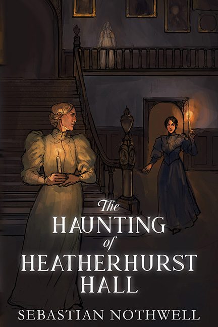
Some book covers whisper “gothic mystery.” Others murmur “haunting romance.” The Haunting of Heatherhurst Hall doesn’t so much whisper as it wheezes softly from the back of the fridge, glowing faintly in the dark, begging to be put out of its painterly misery.
At first glance, it wants to be elegant: candlelight, long gowns, spectral staircase. But stay with it for five seconds and you realize the whole thing looks like it was rendered with a mouse, a dream, and the free trial version of an art app.
Let’s start with the “artwork.” The two women at the center are meant to be drenched in candlelight, but they’re glowing so fiercely it’s less haunting ambiance and more Chernobyl cosplay. Their dresses emit a light source of their own, defying every law of physics, ghost story, and taste. The one in front looks like she’s just remembered she left her tea in 1893; the one behind seems to be walking toward her in a fog of mild regret. Both could be wax figures melting under a studio lamp.
Then there’s the ghostly figure at the top of the stairs — or is it? It could be an apparition. It could be a forgotten brushstroke. It could be the artist’s cat jumping onto the tablet mid‑stroke. Whatever it is, it’s not scary. It’s a translucent blob that might be a person, or might just be the echo of unfinished layers.
The paint by numbers aesthetic really drives it home. Everything looks blocked in, like the artist was halfway through coloring between the lines and just gave up. Even the background has the soft resignation of an undergrad’s “good enough” portfolio piece. And those portraits on the wall? Just dark rectangles with lighter ovals. Faces? Nope. Expression? Not a chance. It’s like the ghosts themselves gave up haunting and settled for vague rectangular representation.
Now let’s talk typography. “The Haunting of Heatherhurst Hall” is presented in elegant serif white — because nothing says “supernatural intrigue” like fonts available in Microsoft Word 2007. It’s perfectly centered, perfectly plain, and utterly mismatched to the chaos behind it. The title sits politely over the art like a teacher giving up mid‑lecture.
What makes this cover so tragic is how close it thinks it is to being good. It has ambition — atmosphere, lighting, mood — but not the technical skill to land any of it. It’s all soft outlines, glowing limbs, and half‑rendered backgrounds. It’s not haunted; it’s just unfinished.
If ghosts haunt unfinished houses, then this art is the eternal limbo of first drafts. You can almost hear the spirits sighing, “We died for this?”
So here it hangs — a dimly lit masterpiece of mediocrity, glowing brighter than any candle should, doomed to forever haunt the fridge of digital art history.
