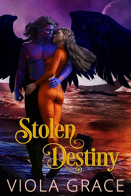
Some covers whisper sweet nothings. This one yells across the cosmos with a foghorn made of neon body paint and poor rendering choices. Stolen Destiny isn’t just a romance — it’s an intergalactic hostage situation between taste and execution. And reader, taste never stood a chance.
Let’s start with the couple. Our leading alien beefcake — body painted in Tron meets tribal flair — clutches his beloved like he’s trying to keep her from floating off into the uncanny valley. He’s blue, muscled, glowing, and entirely too shiny. His skin has the smooth rubber texture of a toy action figure just freed from its packaging. And then there’s the love interest, painted head to toe in an orange catsuit that looks like it was airbrushed on by someone with one setting: “wet.” The intimate embrace? More mannequin merge than romantic melt — they look like 3D renders locked in a slow-motion glitch.
Behind them spreads the winged disaster. Literal wings. Big, black, and somehow both majestic and useless, they float awkwardly from the man’s back like he’s borrowed a pair from a Halloween costume rental and forgot to remove the packaging wrinkles. They cast no shadows. They interact with nothing. They’re not wings — they’re chaos curtains.
Now, let’s talk about that background. This distant world is supposed to scream “alien landscape,” but it mostly just mutters, “Photoshop gradient with a space rock overlay.” We’ve got purplish terrain, lava-toned skies, and two moons thrown in like someone shouted “More planets!” mid-design. There’s no lighting consistency — the background glows from one direction, the characters from another, and the entire scene from some unseen spotlight of doom.
And oh, the typography. Nothing brings this cosmic tragedy crashing back to earth like the font choice of a 2011 wedding invitation. “Stolen Destiny” is styled in curly romance script that looks like it wandered in from a historical drama. The bright yellow clashes violently with the magenta lava fields, while the author’s name — in a completely different font and color — lounges stiffly at the bottom like it was slapped on as an afterthought by someone yelling, “We’re out of time!”
This cover tries so hard. It wants to be passionate. Mysterious. Otherworldly. But instead, it ends up looking like a fanfiction fever dream rendered in a bootleg game engine. The love is forced, the lighting is confused, the color palette is in open revolt, and the visual storytelling is less “stolen destiny” and more “borrowed disaster with no return policy.”
In the vast galaxy of bad covers, this one burns bright —
a solar flare of genre clichés, melted textures, and design ambition gone rogue.
