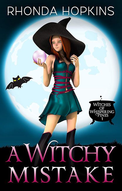
Imagine walking down the fantasy aisle, and suddenly you’re ambushed by a Bratz doll cosplaying at a Spirit Halloween sale. Congratulations — you’ve found A Witchy Mistake, the cover that proves not all spells work as intended. Or maybe this one worked exactly as intended — to hex every rule of design simultaneously.
Let’s start with our leading lady, who appears to be a plastic action figure escaped from a defunct video game tutorial. Her expression? A dead-eyed smirk that says, “I’ve just learned what emotions are, and I choose none.” The hair is airbrushed to the edge of existence, the legs are longer than narrative logic, and that corset ribbon wrapped around her torso looks like someone used the “string” tool in MS Paint.
Now direct your gaze (if you dare) to the typography. The title “A Witchy Mistake” is written in a pink gradient serif font with a beveled effect so intense it could reflect sunlight. The word “Witchy” screams for help — or maybe it just screams. The subtitle, crammed inside a cauldron graphic as if fonts can be brewed like potions, is where design decisions go to die. Bonus points for jamming in three separate font styles across four pieces of text. Diversity, apparently.
And what’s a witch without her magical accessories? We have a perfectly circular glowing orb that casts no light and a cartoon bat with big googly eyes hovering like someone summoned ClipArt 1998. The moon is full, but it’s not enough to save this supernatural spectacle.
Let’s not ignore the glowing halo of soft blue that cocoons the figure, blurring her into the background like a badly feathered Photoshop job. The character appears to be lit by studio lights, yet the scene is supposedly a moonlit night. Somewhere out there, physics is sobbing into its spellbook.
And the overall vibe? Like someone said, “I want this to feel like Sabrina the Teenage Witch meets Winx Club, but without the budget, effort, or irony.”
This isn’t a cozy paranormal cover — it’s the result of dragging genre tropes into a cauldron and hitting “blend” with no lid on. If this book really is Witches of Whispering Pines, Book 1, the Whispering Pines must be groaning under the weight of this design.
In short: this cover didn’t just make a witchy mistake — it graduated summa cringe laude from the Academy of Design Misfires.
Burn it. Not literally. But maybe spiritually.
