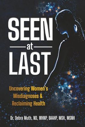
“Seen at Last” – and unfortunately, so is this cover.
Let’s talk about this design disaster masquerading as a motivational health title. This isn’t a cover; it’s a visual identity crisis that wandered into Photoshop and forgot what it was doing halfway through.
First up, the title treatment. We’ve got SEEN and LAST screaming in all caps like they’re in an off-Broadway musical, and then there’s poor little at in the middle, looking like it was just shoved in there as a typographic afterthought. It’s floating between those bold words like a piece of lettuce that fell between sandwich layers. Design hierarchy? No, this thing has design anarchy.
Then we move on to the tagline: “Uncovering Women’s Misdiagnoses & Reclaiming Health.” A powerful concept, sure, but it’s buried beneath the title in cramped, mustard-yellow text that looks like it was pulled from a PowerPoint deck titled “Inspirational Vibes, 2004 Edition.” And just when you think the text placement can’t get any more random, we get the full credentials parade — because nothing says engaging design like five degrees and acronyms lined up like a medical-themed receipt.
And now, let’s address the ghost in the machine: the silhouetted figure of a woman who is somehow glowing and shadowed at the same time. She’s outlined with what looks like a rejected Tron concept sketch, standing in front of a galactic blue smog that may be stars, maybe neurons, or possibly the Winamp visualizer. Whatever it is, it’s not working.
This stock silhouette has been slapped onto a generic science-y background with no connection to the content. Is this book about intergalactic diagnosis? Molecular ghosts? Women’s health in a black hole? We may never know. All we know is that the Photoshop glow effect has been overused here like a high schooler discovering the “Outer Glow” tool for the first time. It’s not enlightening. It’s just confusing.
What this cover lacks is clarity. There’s no visual cohesion. The type is disjointed. The imagery is disconnected. The mood is… what is the mood? Clinical inspiration? Sci-fi mystery? It’s trying to do too many things and failing at all of them. This is a case of trying to look smart without doing the homework.
And look, the message of the book is important — women’s health and misdiagnoses are serious, worthy topics. But this cover does nothing to support that. Instead, it feels like a medical-themed self-help pamphlet from a conference swag bag — generic, sterile, and visually outdated.
If you want your book to stand out, especially on a topic this critical, the cover has to do more than exist. It needs to communicate. This one just kind of hovers in space like a screensaver waiting to be clicked.
Final Diagnosis: Amateur design syndrome with acute typographic inflammation. Prescribed treatment: a complete design overhaul, starting with a new visual metaphor, professional typography, and the removal of every single sparkle.
Seen at last? Maybe. But design like this deserves to remain hidden.
