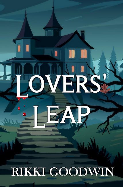
Hold onto your broomsticks, design fans, because Lovers’ Leap has done a graceful swan dive straight into the abyss of Horrible Covers. And by “graceful,” I mean it belly-flopped from a haunted staircase into a vat of clip art.
Let’s start with the star of the show: that blood-dripping “L.” A valiant attempt at symbolism? Perhaps. A visual success? Absolutely not. The blood droplet looks less like horror and more like a cartoon ketchup blob on a grocery store ad. It’s not sinister—it’s snacky. Then there’s the bright red squiggle that may have intended to scream “danger,” but instead whispers “Microsoft Paint 2003.”
Moving on to the background art, which appears to be pulled straight from the discount bin of a Halloween-themed educational poster. The mansion is as menacing as a library after dark. The windows are glowing like they’re powered by night lights, and the shadows have the emotional range of soggy toast. If this is meant to be spooky, the most it’s provoking is a yawn and maybe a side-eye.
Oh, and don’t miss the one lonely brown leaf on the right. What’s its role? Dramatic observer? Ghost of better cover design? Either way, it’s the most emotionally engaged element on this cover.
Now let’s address the typography, because no horror is complete without font-based terror. The title, LOVERS’ LEAP, is set in a stock serif that feels like it was borrowed from a wedding invitation, not a tale of blood-soaked passion and spectral mansions. The spacing between letters feels like a game of hide and seek, and the white-on-muted-blue palette is doing absolutely no favors in the mood department. Romance? Maybe. Murder? Doubtful. Graphic design emergency? Yes.
And while we’re here, a little shoutout to the color palette: blue, gray, black, and… blood red. Like a moody emo teenager decided to design a book cover during math class. There’s no cohesion, no tension—just a bunch of moody hues loitering in Adobe Illustrator waiting for someone to tell them what they’re doing.
Let’s not ignore that everything is just so… centered. The house is centered. The stairs are centered. The tree branches frame the title so perfectly it feels like a Hallmark parody of a horror movie. The result? A composition so safe and symmetrical it drains all sense of suspense. Horror is supposed to unsettle, not look like it was built with a ruler and a risk-averse heart.
To sum it all up: this cover didn’t leap. It tripped, tumbled, and rolled down those dramatic stone steps into the valley of forgettable design.
Final Diagnosis: Lovers’ Leap took a plunge—right into a vat of vector horror and blood-red typography crimes. The only thing scary about this cover is how easily it could’ve been fixed with a little taste, a little tension, and maybe—just maybe—a blood drop that doesn’t look like it was microwaved.
See you at the bottom of the steps. Bring better fonts.
