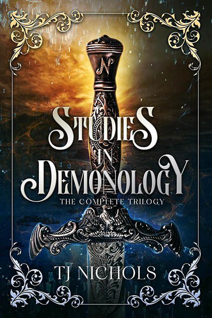
Welcome to Studies in Demonology, where the only thing more dangerous than the demons is the graphic design sorcery gone rogue. What was likely intended to be a dramatic, arcane cover for a dark fantasy epic instead looks like someone fed a sword and a volcano into a glitter cannon and hoped for the best.
Let’s begin at the edges — or should we say, the filigree fog zone. These swirling corner decorations are the design equivalent of tinsel: shiny, directionless, and absolutely everywhere. Are they a frame? Are they magical sigils? Are they the result of a decorative font getting loose and reproducing in the corners? Whatever they are, they serve no function except to scream “fancy!” in a voice that gets shakier the longer you stare at it.
And then there’s the sword. Oh, the sword. Majestically centered, as if to say, “I’m the main character now,” this blade has been cut and pasted with all the grace of a third grader discovering layers for the first time. It’s not interacting with the scene — it’s floating awkwardly above it, like it’s being held up by an invisible PowerPoint slide. The lighting? Doesn’t match. The shadow? Nonexistent. The integration? None. The sword is simply… there. Like an object found in a hidden object game you’re not allowed to click on.
Now, brace yourself for the background: a lava-spewing volcano, covered by what appears to be — and we say this with deep spiritual hesitation — broken glass? There’s a shattered pattern veiled across the entire cover, as if someone threw a snow globe at a fantasy realm and left it there. It’s hard to tell whether the world is exploding, freezing, or stuck in a cursed Windows 95 screensaver. Maybe all three.
Let’s not forget the sprinkles. Glowy, glittery particles raining down over the top of the whole thing, like fantasy dandruff. Is it magic? Rain? Pixie fallout? We’ll never know, but we do know this: when your magical elements start to look like trapped bugs under cellophane, it’s time to put the sparkle brush down.
Typography? Buckle up. The title font is doing the absolute most. Curly serif swashes here, aggressive sizing there — it’s practically dancing across the blade, begging for attention. It’s the kind of font that enters a room and instantly trips over its own cape. Meanwhile, “The Complete Trilogy” quietly sobs in small caps underneath, trying to hold it all together with nothing but dignity and Times New Roman energy.
Final Analysis?
This isn’t a cover — it’s a Photoshop performance piece about what happens when every single fantasy trope gets thrown into the design blender at once. Sword! Fire! Magic! Frame! Glitter! Volcano! Glass shards! Rain! Filters! Bevels! Chaos reigns supreme, and not in the cool, demonic way.
This isn’t Studies in Demonology.
It’s Intro to Overdesign: Please Stop Adding Layers 101.
