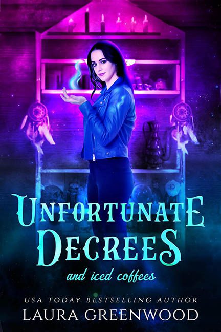
Welcome to Unfortunate Degrees and Iced Coffees, where magic meets caffeine addiction and both are crushed beneath the weight of too many Photoshop filters and a font combo that should come with a warning label.
This cover walks into the room glowing like it just left a rave in a metaphysical candle shop. Our central figure — the Witch of Instagram Filters Past — is giving us serious “final project for an online design course called Making Magic Pop!” Her lighting doesn’t match the background, her shadow has gone into witness protection, and the glowing spell in her hand looks like a mystical Microsoft Clippy trying to help her cast an enchantment.
The setting? A neon-pink potion closet. Possibly a back room of a magical Etsy shop. Dreamcatchers dangle beside glowing jars of “stuff,” but everything is so over-saturated and soft-lit, it’s hard to tell if she’s about to cast a hex or host a sponsored crystal haul on TikTok.
And now, let’s talk typography — or as we call it here, The Triple-Font Tragedy.
-
The main title, Unfortunate Degrees, uses a fantasy font that seems to have taken a few too many potion shots. Random capitalizations, inconsistent sizing, and spacing that screams “eyeballed, not aligned.”
-
Then there’s “and iced coffees” — rendered in a handwritten font that wouldn’t look out of place on a chalkboard sign for seasonal lattes. Charming? Maybe. Coherent? Not even a little.
-
Just when you think it can’t get more chaotic, in strolls LAURA GREENWOOD in a crisp, elegant serif that looks like it wandered in from a different book — possibly a courtroom drama.
This isn’t typography — it’s a genre identity crisis held together with wishful thinking and caffeine.
What really seals the deal is the mood: the cover wants to be quirky urban fantasy, but visually it lands somewhere between Pinterest Wicca and mall kiosk sorcery. The purple glow, dreamcatchers, and “girl with attitude” pose are all trying so hard, but the result is more “Hot Topic promotional poster” than professional cover art.
Final thoughts?
This isn’t magic. This is Photoshop at 2 AM with a venti cold brew and no spell-check. It doesn’t entice — it confuses. It doesn’t enchant — it bedazzles. With a glowing hand effect that looks like it was borrowed from a 2010 wizard blog and color grading that could blind a dragon, this cover isn’t casting spells — it’s triggering migraines.
This isn’t Unfortunate Degrees and Iced Coffees.
It’s Uncoordinated Layers and Filter Fatigue. And no amount of caffeine can fix that.
