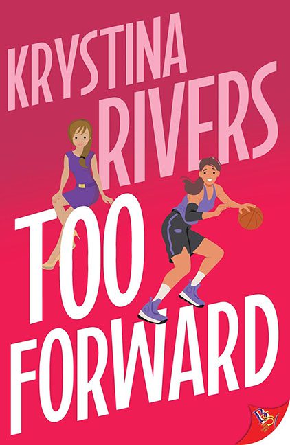
When a book cover makes you long for the clarity of a highway billboard, you know we’ve arrived at another tragic design crossroads. Too Forward barrels into the court with all the finesse of a half-deflated dodgeball — and yes, we’re naming this the MVP of misplaced vectors.
Let’s start with the typography tantrum happening here. “KRYSTINA RIVERS” stretches across the top like a rogue karaoke title — bold, tall, and demanding attention like a contestant on The Voice who missed their cue. The title “TOO FORWARD” is so aggressively jammed against the figures that we have to wonder: is the typography attacking, or is it just confused about personal space?
And speaking of space, let’s address the players on this pink stage of confusion. One character is casually perched on top of the “T,” looking like she’s waiting for a bus or contemplating her life choices. Meanwhile, our second figure — presumably mid-dribble — is running straight into the word “FORWARD,” as if attempting to escape the layout altogether. Can you blame her?
The clip-art stylings bring us right back to educational pamphlets from 1997. The anatomy is wobbly, the motion is stiff, and there’s about as much shading as a paper doll. The basketball itself is the only thing with real ambition on this cover — and even that’s been reduced to a flat orange afterthought.
Color-wise, this thing is dipped in Pepto-Bismol pink, perhaps as a soothing agent for the headache it induces. And the fonts? A mismatch of bold sans-serifs and skewed kerning that looks less like design and more like a cry for help.
This isn’t cover art. It’s a halftime show gone wrong.
And somewhere, a designer’s Wacom pen is weeping.
Bottom line? Too Forward is too loud, too messy, and too reliant on a color palette that screams “emergency valentine.” Next time, maybe pass the design to someone who knows what a baseline is — in basketball and graphic balance.
Foul called. Cover ejected.
