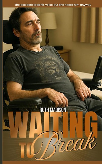
“The accident took his voice, but she heard him anyway.”
Well, here’s a thought — maybe someone should’ve taken this cover designer’s mouse. Because what we have here isn’t a book cover; it’s a slow-motion graphic design disaster dressed up like a heartfelt drama.
Let’s talk about the photo — a stock image so stiff and lifeless you can practically hear the shutter clicking through the awkward silence. This man isn’t just contemplating the void; he is the void. His facial expression says “meaningful silence,” but his body language says “I’ve been on hold with customer service for 47 minutes.” This isn’t cinematic emotion; it’s a casting call for Discount Brooding Guy #3.
And then, smack-dab in the center of his chest, like an unspoken metaphor that got lost on the way to relevance — a lion face t-shirt. A lion. Because apparently, nothing says “devastating romance and emotional recovery” like a Walmart clearance aisle graphic tee. Is it supposed to be symbolic of courage? Inner strength? Budget cuts? Whatever it is, it’s roaring for all the wrong reasons.
Now, the typography. Strap in.
“WAITING” comes barreling in with the energy of a used car ad — bold, bronzed, and as subtle as a sledgehammer to the shin. The thick block letters dominate the bottom half of the cover like they’re about to sell you a Labor Day mattress. Then “to Break” sashays in with a swooping script font that looks like it wandered in from a YA romance novel and decided to just go with it. The two styles clash like oil and vinegar — if vinegar was also on fire.
And speaking of clashing: the colors. This palette is what happens when beige and bronze get into a bar fight and no one wins. The overall mood is “autumn brochure for a low-energy grief retreat.” There’s no contrast. No vibrancy. It’s the graphic design equivalent of a sigh. Even the lighting is so flat and uninspired, it makes the photo look like a behind-the-scenes still from an early 2000s hospital drama that never got greenlit.
But let’s not forget one of the crown jewels of this catastrophe — the layout. The text is stacked like a Jenga tower built by a toddler. The author’s name, “Ruth Madison,” is wedged right between the chest lion and the typography trainwreck, looking like it’s praying for a better line break. There’s no spacing hierarchy, no rhythm, just the visual equivalent of someone muttering “good enough” and hitting export.
The tagline, meanwhile, is peak corporate melodrama. “The accident took his voice but she heard him anyway.” A line so overcooked it could be served at a Lifetime movie buffet. It doesn’t inspire intrigue — it triggers an eye-roll reflex that may require medical attention.
In the end, Waiting to Break isn’t just a title — it’s a full-blown warning. The cover is waiting to break under the weight of its own graphic confusion. It’s waiting to be redesigned. It’s waiting for someone to admit that dragging and dropping fonts onto a stock photo isn’t a substitute for professional cover design.
This cover didn’t just break — it collapsed under the pressure of trying to look profound while using a Shutterstock subscription and a free trial of WordSwag.
Next time, skip the lion tee and maybe… hire a designer.
