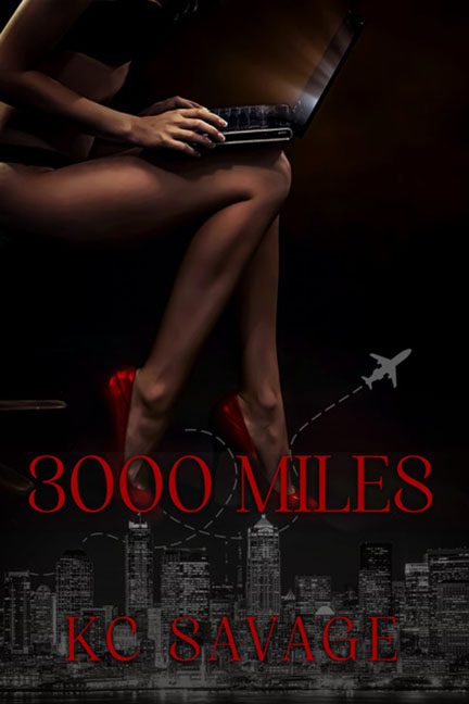
If a cover could speak, 3000 Miles would whisper, “I’m sexy, mysterious, and possibly about corporate espionage… or maybe just a woman who travels in high heels with a suspiciously warm laptop.” Unfortunately, it doesn’t speak so much as slur its way through a cocktail of mismatched images and late-night design choices. This isn’t a book cover — it’s a design puzzle that no one asked for, and none of the pieces fit.
Let’s start with the centerpiece image: a woman’s disembodied legs, polished to an uncanny shine, positioned seductively atop an invisible chair with a glowing laptop and even glowier red stilettos. She’s typing something, presumably a plot, though we have no proof one exists. Her torso? Vanished. Her face? Irrelevant. This woman isn’t a character — she’s a pair of promotional legs left over from a Victoria’s Secret ad shoot that got interrupted by a blackout.
Hovering awkwardly below her shins is a city skyline, clearly pulled from a completely different photo, filtered into grayscale like it wandered in from a gritty crime drama cover. But wait — here comes the tiny clip-art airplane, weaving its dashed line flight path dangerously close to our heroine’s left calf. Its destination? Graphic design rock bottom.
And let’s not forget the typography, because this font choice deserves its own frequent flyer miles. “3000 MILES” and “KC SAVAGE” are slammed across the cover in a loud, all-caps serif font that’s supposed to be seductive and dramatic but ends up looking like the title sequence of a forgotten 1998 direct-to-video erotic thriller. The red-on-black color scheme screams danger — or would, if the red weren’t so dark it’s nearly unreadable. It’s a masterclass in “good idea, terrible execution.”
Speaking of danger — what exactly is this book even about? The imagery suggests romance, danger, air travel, espionage, laptop-based seduction, maybe a shoe commercial? The laptop implies business. The shoes scream “date night.” The airplane is begging for an escape. The cityscape is just… there, fulfilling its duty as obligatory urban mood lighting.
There’s so much genre whiplash, it’s hard to tell what shelf this belongs on. Is this a steamy transatlantic love story? A cyber-thriller? A memoir from a jet-setting shoe blogger? You could pitch this as “50 Shades of Frequent Flyer Miles” and still be no closer to clarity.
And let’s talk composition: it’s a vertical sandwich of chaos. Legs at the top. Plane in the middle. Buildings at the bottom. It’s less of a book cover and more of a magazine ad layout that missed its deadline and got recycled into Kindle fodder.
But the most damning part? It doesn’t look finished. The lighting doesn’t match. The elements don’t belong in the same visual universe. The blending is lazy, the hierarchy nonexistent, and the vibes? Confused and exhausted.
In the end, 3000 Miles isn’t just the distance between the protagonist and her lover — it’s the distance between this design and anything resembling professionalism. It’s a long, lonely flight through bad font choices, confusing symbolism, and stock image purgatory.
Fasten your seatbelt, folks. This cover crash-landed.
