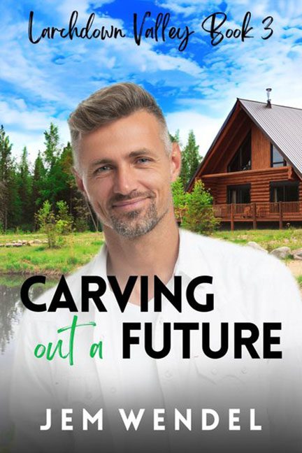
Let’s take a stroll down to Larchdown Valley, where the air is crisp, the cabins are rustic, and the book covers are built entirely out of stock images, poor lighting choices, and title fonts that scream, “I made this on my lunch break in Canva.”
Behold: Carving Out a Future — a cover so aggressively generic, it could be the poster child for “Romance Novel Template: Logging Edition.” Right off the bat, we’re introduced to our protagonist, who appears to have materialized mid-Photoshop into the foreground like a hologram programmed for dad jokes and emotional growth. His expression says “I’m approachable,” but his body says “please crop me better.”
Let’s talk about that cut-and-paste disaster. This silver fox isn’t actually in front of the cabin — he’s levitating in front of it. The lighting on his face? Indoor, studio, possibly ring light. The lighting on the cabin? Natural daylight with just a hint of Hallmark. The result? Our guy looks like he’s been green-screened into a vacation rental listing. There’s not even a whisper of shadow to ground him. He’s just floating there like a rustic apparition sent to help you organize your feelings and maybe install a deck.
And then there’s the background: a perfectly tranquil log cabin scene that’s so obviously stock it’s probably been used for real estate ads, lumber mill brochures, and four separate “find yourself in the woods” self-help books. This forest wasn’t curated for romance — it was downloaded in high-res for $9.99.
Now let’s carve into the typography, because this cover really gives us a sampler platter of bad choices.
-
“CARVING” and “FUTURE” are in bold sans serif — a font trying to be modern and confident but actually just looks like it’s about to announce a new car model.
-
The phrase “out a” is awkwardly scribbled in a green script font that looks like someone’s niece wrote it on a smoothie bottle.
-
The styles don’t blend; they battle. One’s commanding, the other’s whispering sweet Pinterest nothings. It’s like putting flannel over sequins and calling it a look.
The series title at the top — “Larchdown Valley Book 3” — is rendered in a curly script that belongs on the side of a mason jar, not on a published novel. Is this a romance novel or a line of organic jams? Who can say?
And of course, we have the title itself, Carving Out a Future, which sounds less like a romance and more like a TED Talk by a motivational woodworker. Combined with the cabin, the font choices, and Mr. Smize here in his dental office lighting, the whole thing feels like a mashup of HGTV, a midlife crisis, and a weekend getaway brochure.
Here’s what’s missing: emotion. Energy. Genre clarity. Anything that makes you feel something other than “this looks like the cover of every third self-published romance on Amazon.” There’s no story here. No stakes. Just a floating man and a vacation rental that’s tired of this nonsense.
In the end, Carving Out a Future gives us everything except a compelling future in graphic design. The vibe is less “heartfelt small-town love story” and more “Pinterest board for dad-core cabin fantasies.” It’s not carving out a future — it’s whittling away your will to browse further.
