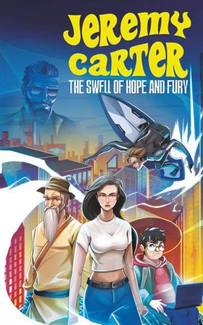
Hope is swelling. Fury is rising. And the only thing more powerful than both is the sheer visual confusion radiating from this cover like a static-charged anime fever dream.
Let’s talk about Jeremy Carter: The Swell of Hope and Fury, a title that sounds like it’s gearing up for epic adventure, heroic stakes, and perhaps a bit of self-insert empowerment fantasy. What we get instead is a chaotic montage that feels like a group project where no one agreed on the theme.
First, the typography — or, as we like to call it, the mood killer.
The main title “Jeremy Carter” is rendered in a yellow bubble font straight out of a 1970s breakfast cereal box. It screams “zany children’s book” — except directly below it, the subtitle “The Swell of Hope and Fury” tries to stage a dramatic tone shift like it’s auditioning for a gritty CW reboot. The fonts are at war, and neither is winning. There’s no cohesion, no hierarchy, and definitely no respect for tone. It’s like pairing a kazoo solo with a funeral march.
Now brace yourself — because here come the characters.
At center stage, we have our protagonist (presumably Jeremy), who looks like she just stepped out of a Pinterest board titled “Determined Anime Women”. Her face is serious. Her outfit is minimalist. Her waist is barely wide enough to support internal organs. She’s flanked by:
-
A wizardly old man in a sunhat and bathrobe who appears to have wandered in from a desert-themed app game.
-
A bespectacled hacker boy clutching a laptop like it contains state secrets — or a Minecraft server.
-
And in the sky: a jet-propelled skater with a ponytail, mid-barrel roll, defying gravity, physics, and possibly the very concept of narrative cohesion.
Hovering ominously in the background is Ghost Dad in Aviators™, watching over the cityscape like a judgmental LinkedIn profile photo. Is he the villain? A mentor? An insurance agent? His presence raises questions — none of which are answered by the cover.
Then we get to the setting, which is… well, a setting. A half-rendered neon city skyline, vaguely futuristic, vaguely made with gradient presets. Random arcs of white lightning squiggle across the composition like someone fell asleep on the pen tool.
The overall effect?
It’s like if Spy Kids, Persona 5, X-Men: Evolution, and a high school graphic design elective all shared one Red Bull and tried to make a poster in 45 minutes.
There’s no clear focal point, no unified art style, and no understanding of visual storytelling. The characters aren’t interacting, the background feels like a placeholder, and the entire layout suffers from genre identity crisis. Is this for kids? Teens? Retro sci-fi fans? Tech thriller junkies? We may never know — because the only thing swelling here is our confusion.
In conclusion: The Swell of Hope and Fury?
More like The Swell of Unclear Direction and Font Abuse.
Jeremy, buddy — we believe in your mission.
But your cover? It needs a team of heroes just to explain what’s happening.
