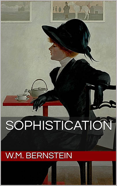
Sophistication. It’s a word that evokes poise, restraint, grace. You expect elegance. You expect finesse. You expect… well, something other than this cover, which looks like someone rage-typed in Microsoft Publisher after Googling “free classy painting” and calling it a day.
Let’s start with the foundation: a beautiful vintage painting, likely plucked from the public domain like a thrift store scarf someone tried to make look high fashion. The woman in the image exudes quiet elegance — gloved, hat tilted just so, tea cup mid-sip, lost in reverie or possibly contemplating the unholy design choices about to be inflicted on her.
And then — BAM — enter THE BLACK RECTANGLE.
Because nothing says refinement like a thick, semi-transparent slab of digital asphalt parked directly across the torso of a 19th-century lady. The title “SOPHISTICATION” is slapped on in all-caps sans-serif like it’s leading a corporate rebrand rather than a nuanced literary work. It’s bold. It’s basic. It’s bland. The spacing is mechanical, the kerning is indifferent, and the overall vibe is less Henry James, more monthly internal memo.
Not to be outdone, we have the red rectangle of doom squatting below the first, boldly shouting the author’s name like it’s breaking news. If this were a cereal box, we’d be promised 25% more fiber. Instead, we get 100% more “What were they thinking?”
These bars — the black and red — slice the artwork into graphic purgatory. No harmony. No hierarchy. Just a hostile takeover of bad taste, completely severing the mood set by the image. You can almost hear the woman in the painting sigh, “I dressed for tea, and they dragged me into a low-budget thriller promo.”
But wait, it gets better. There’s no attempt to integrate anything. The font doesn’t echo the time period. The rectangles don’t frame — they smother. It’s like someone was afraid to let the art speak at all, so they just yelled over it. You know how minimalism can be striking when done right? This is what happens when minimalism gets drunk and loses its sense of self.
And here’s the kicker: the title is Sophistication.
SOPHISTICATION.
This cover is the visual equivalent of naming a dog “Professor” and then watching him eat a crayon. It promises elegance and delivers design decisions that look like they came from a 2008 PowerPoint theme.
In the end, we don’t blame the painting. We don’t even blame the hat (which is, frankly, the most sophisticated thing here). We blame the graphic design sins that took a classic image and said, “You know what this needs? A Windows 95 UI overlay.”
So if you’re thinking of buying this book, here’s my advice:
You can judge a book by its cover.
And this one? It’s all tea, no class.
