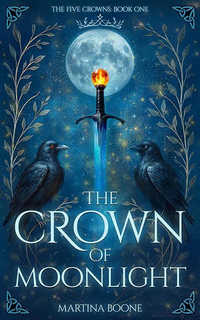
At first glance, The Crown of Moonlight looks like it might pass as a proper fantasy cover—moody lighting, glowing sword, mystical crows. But look closer, and the illusion collapses faster than a villain monologuing under a collapsing castle.
Let’s begin with the crows. Noble, shadowy, mysterious… and clearly cut-and-pasted from a different dimension. Their claws dangle awkwardly in midair like they’re gripping invisible perches from a forgotten background layer. They’re not perched—they’re hovering. Majestic? No. Possessed? Maybe. The lighting doesn’t match, either. These birds are lit from the front, possibly by an off-camera IKEA lamp, while the sword beside them is glowing from the left. It’s less a unified scene and more a group photo where no one got the memo about the light setup.
Speaking of that sword—jammed dead center like the world’s most aggressive kebab stick. It radiates a dramatic blue glow that might be cool if it weren’t completely at odds with the birds and background. The flame on top? More birthday candle than mythical power source. This isn’t Excalibur—it’s Exca-literal.
Now, let’s talk about the decorative chaos framing this celestial mess. The upper corners are adorned with Celtic knots that feel about as thematically connected to the rest of the design as a QR code would. They’re flat, graphic, and totally out of sync with the faux-painterly, overwrought textures below. It’s like someone copy-pasted them from a generic “Celtic Clip Art” folder labeled ‘Maybe?’
And then—oh, the filigree. That ornate vine pattern winding through the design? It’s suffering. Not because it’s poorly drawn, but because the black fill behind it wasn’t removed properly. That leftover void creates little digital potholes across the design, turning what should have been graceful scrollwork into clunky silhouette spaghetti.
But wait—there’s more! The sky is having a full-blown glitter crisis. The stars are everywhere, evenly distributed with all the restraint of a toddler let loose with a sparkle brush. No layering, no fading, just twinkle vomit across the entire night. The background reads less “enchanted realm” and more “Lisa Frank launches a YA imprint.”
The typography is the least offensive part, which is really saying something. It’s big, legible, and planted firmly in the “generic epic fantasy” camp. It does its job. It’s just trapped in a scene that looks like a desktop wallpaper generator got bored and started freelancing.
Final verdict? The Crown of Moonlight is a sparkly trainwreck with delusions of grandeur. It tried to serve moonlit mystery and ended up with pixel salad and bird limbs floating in space. All crown, no kingdom.
