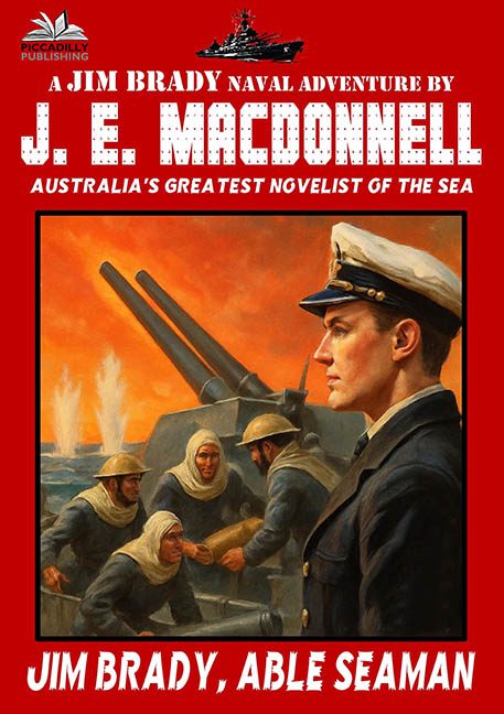
Jim Brady, Able Seaman is a book cover that sails directly into disaster—and forgets to deploy the lifeboats. It’s not just bad. It’s a full-scale naval design emergency, the kind of layout that should come with a foghorn warning and a prescription for sea-sickness.
Let’s start with the headline assault happening at the top: “A JIM BRADY NAVAL ADVENTURE BY J. E. MACDONNELL” — a string of words so loud and forceful, you can almost hear them being barked through a megaphone at military boot camp. The font is massive, bold, and doing everything short of grabbing you by the collar and yelling “BUY THIS BOOK, MATE.” Subtlety? Lost overboard.
But it gets better—or worse. Just beneath the author’s name, in red-on-red, all-caps font (with the exact same energy as a clearance sign in a sinking ship), we’re informed that J.E. MacDonnell is “AUSTRALIA’S GREATEST NOVELIST OF THE SEA.” This may be true, but this design isn’t doing the man any favors. In fact, it looks like it was built entirely out of national pride and a free font site.
The center of the cover is a vintage painting, and frankly, it’s the only thing here trying to hold the line. We’ve got men scrambling on a naval gun deck while flames rage in the background. There’s drama! Action! Fire! But just as you’re caught up in the cinematic tension, you’re blindsided by the enormous profile of a man—presumably Jim Brady—staring nobly off into the distance like he’s auditioning for a cologne ad called Gunpowder & Duty. He’s lit like a studio portrait, dropped into a warzone like someone photoshopped a LinkedIn profile pic onto a historical mural.
This cover doesn’t frame the artwork—it kidnaps it. The bold red background screams, the boxed painting sulks, and Jim Brady floats beside the action like he’s been pasted in from another book entirely. It’s like someone cut out a navy recruitment poster, added a propaganda film still, and then shoved both inside a Word document template marked “Urgent.”
And that title at the bottom? “JIM BRADY, ABLE SEAMAN.” Let’s give points for honesty. He is a seaman. He is named Jim Brady. But slapping the title across the bottom in massive white block letters ensures no one misses it—even if they wanted to. It’s less “book title” and more “headline from a tabloid for sailors.”
Final verdict? Jim Brady, Able Seaman deserves better than this loud, layout-agnostic, design disaster. This isn’t just bad typography—it’s typography gone rogue in international waters. Man overboard! Graphic design not even attempting a rescue.
