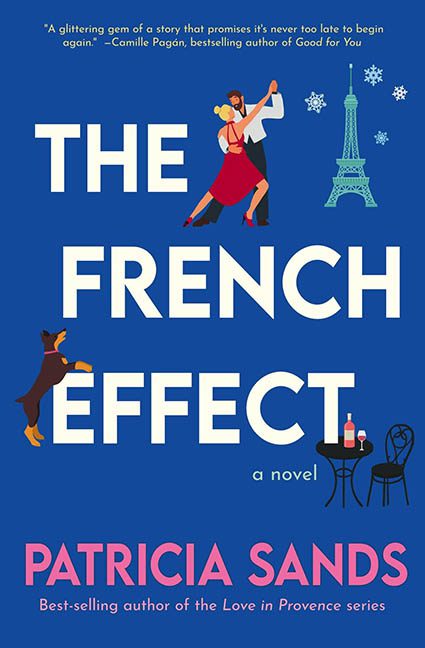
Ah, The French Effect. A title that promises love, charm, and maybe a little wine-fueled whimsy. What we actually get is Paris by way of PowerPoint—a cut-and-paste parade of vector clichés tossed onto a blue background with the precision of a baguette cannon.
Let’s begin with the elements. And oh, are there elements.
Front and center, we’ve got a dancing couple frozen mid-twirl—because nothing says “romantic European escapism” like two clipart figures pirouetting on a completely invisible floor. They’re not standing on a sidewalk. Or in a ballroom. They’re just hovering in the Parisian void like ghosts summoned by a travel agency ad from 2006.
Then there’s the Eiffel Tower, because legally you’re not allowed to publish a book with “French” in the title without slapping it somewhere on the cover. Here, it floats on the right like a decorative toothpick, unmoored and totally unbothered by scale, perspective, or relevance.
But the real showstopper? The dog. Mid-jump. Facing the “E” in “FRENCH” with an energy that can only be described as “romantic confusion.” Is it attacking? Celebrating? Reenacting a tragic font-related memory? It looks like it’s either about to hump the title or bite it. Either way, this dog has opinions about kerning.
Lower down, we find the classic bistro table and chairs, complete with wine and an untouched baguette—a nice touch if the rest of the cover weren’t collapsing into clipart bedlam. These objects aren’t part of a scene—they’re floating stickers slapped on like your drunk aunt trying to decorate a digital scrapbook of her “French phase.”
And then there’s the snowflakes/confetti/random glitter specks. What are they? A romantic snowstorm? Champagne bubbles? The ghost of better design decisions? Whatever they are, they’re scattered like digital dandruff across the top third of the cover, achieving absolutely nothing except mild distraction.
Typography? Fine. It’s bold. It’s clean. It’s… just there. “THE FRENCH EFFECT” in stark white, no interaction with the art around it—except for being visually assaulted by a leaping terrier. The author’s name in bubblegum pink is cute, if a little jarring. It’s like a Hallmark card snuck onto the dust jacket.
Final verdict? The French Effect is not a cover—it’s a Pinterest board that got stuck in customs. From the floating dancers to the aggressively enthusiastic dog, this cover has all the French vibes of an airport gift shop keychain rack. It tried to be whimsical and chic, and ended up as “Oui Oui, Why Though?”
Somewhere in France, a designer is quietly chain-smoking in despair.
