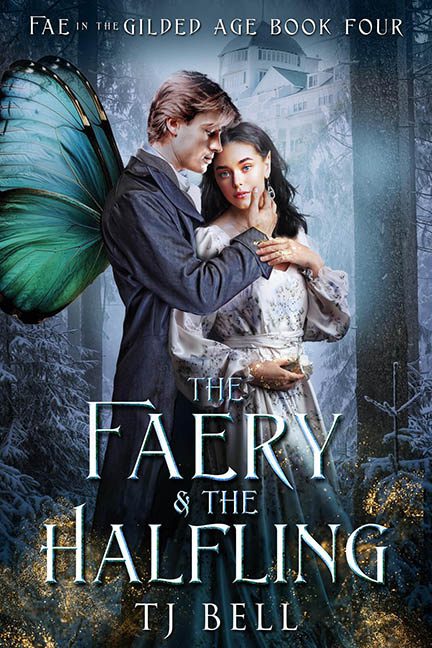
There are book covers that whisper magic. Some that murmur romance. And then there’s The Faery & the Halfling, which loudly announces: “I just discovered Photoshop layer masks, and I’m not afraid to use them poorly.”
Welcome to the visual masquerade that is Fae in the Gilded Age, Book Four—a title so grand it deserves better than this unfortunate cut-and-paste cosplay prom. Let’s begin with the faery in question. His wings—if we’re calling them that—appear to have been borrowed from a monarch butterfly that died tragically in a stock photo dumpster fire. Not only do they look suspiciously flat and limp, but they also aren’t even pretending to be attached to his back. They hover near his spine like a shy intern on their first day—present but deeply unsure of their role.
Next, we turn to the halfling heroine, gazing into the distance as though she, too, just noticed the wings and is reconsidering all her life choices. Her dress is a sparkly affair of stock satin and vague Regency influences, paired with the distinct glow of “lit by an entirely different lighting rig.” Her partner, meanwhile, has the glossy skin tone of a man who’s either been edited within an inch of his life or just moisturized with petroleum jelly.
The pose is your standard romance novel embrace: one hand under the chin, one around the waist, and both people looking off in opposite directions like they just remembered two different plotlines. It’s giving awkward engagement photo session, but with 30% more brooding.
Let’s talk about that background, which is either a frosted forest or the set of a Hallmark fantasy murder mystery. There’s a castle-slash-manor looming in the fog that contributes absolutely nothing except visual clutter. The trees are lifeless, the atmosphere murky, and the lighting? Uncoordinated chaos. It’s the winter version of a green screen gone rogue.
And then—then—there’s the golden glitter swirls at the bottom. They exist purely to say, “Yes, this is fantasy,” in case you were confused by the faery/human hybrid prom shoot happening above. They don’t interact with the scene, the characters, or even the title. They’re just… there. Like the parsley garnish of bad digital design.
Speaking of the title—The Faery & the Halfling—you’d expect something whimsical, delicate, or at least typographically consistent. Instead, we get aggressive beveling, cool-toned gradients, and letter spacing that whispers cheap premade template. “& the” is squashed like it’s not allowed to speak at the font family reunion.
This isn’t magical realism—it’s Photoshop romanticism gone rogue, a hodgepodge of fantasy clichés, misplaced gradients, and stock imagery desperately clinging together under the illusion of drama.
In short: This isn’t fae. This is faux.
