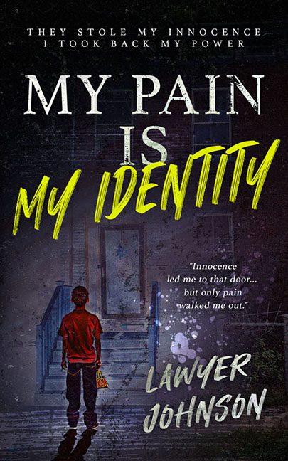
Some covers whisper pain. This one scream-cries it with three fonts, a murdery glow effect, and what looks like a coffee stain splashed onto the emotional climax.
Welcome to the visual therapy session no one asked for: My Pain Is My Identity, where font selection is its own trauma arc.
Let’s begin with the title typography, because wow. “MY PAIN IS” is rendered in a respectable serif, then dropkicked into chaos with “MY IDENTITY” in blaring yellow brush script that looks like it was ripped off a motivational sports drink ad. Apparently, your identity is formed in a CrossFit class during a power outage.
But we’re just getting warmed up. Lawyer Johnson’s name is written in a chalky, jagged font that looks like a scream carved into a school desk. There’s a glow effect, for reasons best left in the editing software’s “effects I regret” folder.
Now feast your eyes on the imagery, a murky dusk-scene with a child trudging toward what may be a haunted house, a courthouse, or an abandoned Olive Garden. The lighting on the figure doesn’t match the background, making him float like a confused ghost of cover design past.
Then there’s the random splatter beside the pull quote. Blood? Bleach? Ink? Emotional damage? Who knows—but it’s just sitting there like, “Surprise! Trauma dot PNG!”
Speaking of the pull quote: “Innocence led me to that door… but only pain walked me out.” An intriguing idea—but on this cover, it reads more like a discarded emo song lyric lost in a font file.
And finally, the tagline at the top—“They stole my innocence / I took back my power”—is stacked with the emotional subtlety of a courtroom drama written by a motivational poster. It’s floating above the rest of the design like it’s being held hostage by bad kerning.
What’s the genre? Memoir? True crime? Motivational suspense thriller with a hint of haunted therapy? Your guess is as good as the art director’s, assuming there was one.
This cover doesn’t just tell us the protagonist is in pain. It inflicts pain—on design principles, on typography, and on anyone trying to make sense of it.
So here we are: an identity built out of drop shadows, misplaced emotion, and font soup.
Your pain may be your identity, but your cover is a public design incident.
