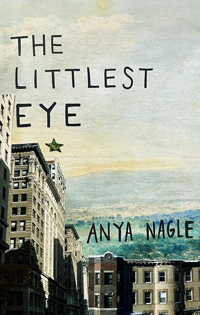
Ah yes, The Littlest Eye, brought to you by the fine folks at Graphic Design Is My Passion Publishing. If you’ve ever wondered what happens when a ransom note and a postcard from 1973 have a lovechild, this cover is your answer.
Let’s start with the font—clearly chosen from the “Creepy Handwriting 101” collection. It’s scattered across the skyline like letters falling off a refrigerator, and we can’t help but read it like a deranged poetry slam:
“THE… LITTLEST… EYE?”
Are we supposed to pause for dramatic effect? Is the “eye” hiding behind that off-brand Lisa Frank star sticker glued randomly into the sky? Because whatever it’s doing, it’s certainly not helping.
Speaking of that green star—it’s not a symbol, it’s not art, and it’s definitely not subtle. It’s like someone earned a gold star in MS Paint and proudly slapped it on before submitting the final draft. The star floats in lonely exile, asking the reader to consider: why am I here? The answer? No one knows. Not even the star.
The buildings themselves feel like they were borrowed from three different postcards, stitched together with the care of a last-minute science project. There’s a strange tilt, a hint of uncanny valley in the lighting, and no cohesion whatsoever. Did the artist trace this with their non-dominant hand while blindfolded? Possibly.
And let’s not ignore the title placement. It’s as if the words are playing hide-and-seek with the buildings. The “EYE” is dangling awkwardly off to the left like it’s trying to escape the rest of the book. “Don’t look at me!” it seems to say. “I had nothing to do with this!”
This cover manages to be both boring and chaotic—an impressive feat. It’s a design enigma wrapped in a mystery, duct-taped to a skyline, and sealed with a single, confused sparkle.
Final Thought:
If this cover had a littlest eye, it was probably crying softly in the background while the designer clicked “save as final.”
