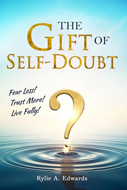
Ah yes, The Gift of Self-Doubt—because nothing says personal transformation like a giant floating question mark and a motivational tagline that feels like it was peeled off the back of a cereal box. This cover wants to uplift your spirit and challenge your inner critic, but what it really does is drown your aesthetic sense in a gold-plated puddle of design clichés.
Let’s begin with the centerpiece: the gold question mark. Floating majestically above a tranquil ripple, it’s trying so hard to be symbolic, but it ends up looking like a lost emoji from a Tony Robbins sticker set. It gleams, it shimmers, and it asks the eternal question: Why does this look like the default PowerPoint background for a leadership retreat?
Beneath this existential punctuation mark lies a tiny gold star, perched on the water like it’s about to grant you three wishes or sell you an NFT. It’s meant to represent hope, or direction, or possibly just the designer shouting “Add something here, it’s too empty!” The whole scene glows with a suspicious digital sheen, like it was assembled from stock photos that were rejected for being too obvious.
Now let’s talk typography—because this cover came to commit font-based felonies. The title uses an ultra-serious serif font to give it that “literary gravitas,” but only “GIFT” gets the gold treatment, as if self-doubt was late to the rebranding meeting. Above the golden ripple, we find not one, not two, but three separate inspirational commands:
Fear Less! Trust More! Live Fully!
Delivered in a slapdash handwritten font that looks like it was borrowed from a motivational wall decal sold at Target. The mismatch between fonts is jarring. This isn’t typographic variety—it’s a visual identity crisis in three acts.
And finally, we have the background: a serene blue gradient with just enough lighting effects to scream “stock spirituality.” It’s meant to be calming, but it ends up feeling like the pre-installed wallpaper on your aunt’s iPad—the one she uses to check her horoscope and forward email chains about positive thinking.
This cover doesn’t inspire clarity or curiosity. It inspires secondhand embarrassment, like watching someone confidently quote their own business card during a networking brunch. It’s trying to sell insight, but the only thing it truly delivers is a crash course in how not to design a self-help book.
The Gift of Self-Doubt might be well-intentioned, but this cover wraps it in the aesthetic of a feel-good pyramid scheme flyer. It’s less “transformational wisdom,” more “PowerPoint presentation about how to manifest better time management.”
The only thing doubting itself here should be the design software used to make this mess.
