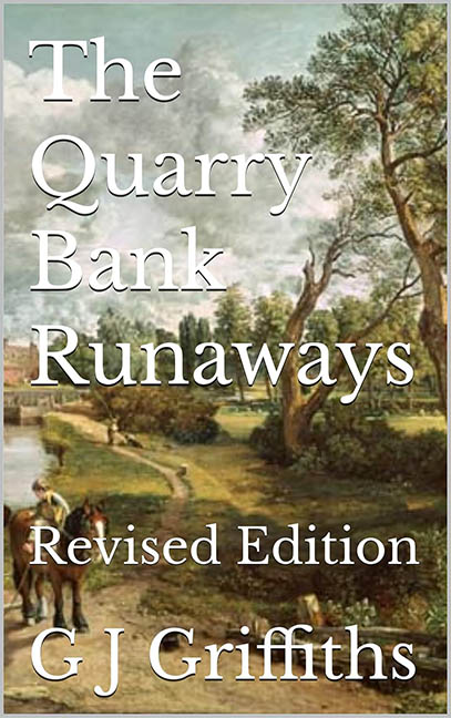
When you think of the word “runaway,” you might expect action, urgency, or even a whisper of drama. What you probably don’t expect is a book cover that looks like it wandered into a museum gift shop, tripped over a public domain painting, and never got back up. Welcome to The Quarry Bank Runaways, where the only thing running away is the design sensibility.
Let’s start with the background image. At first glance, you might think you’ve stumbled across a faded postcard from 1842. It’s a pastoral landscape that may or may not involve some tiny, blurry figures on horseback—hard to say, since they’re being smothered by white text with the delicacy of a paint roller. This is a classic case of stock image abuse, only worse—because it likely isn’t stock at all, just a historical painting that was kidnapped and forced into service without a moment of design consultation.
The typography? Imagine Times New Roman, but make it fashion—except don’t. The title is stacked like it’s solving a spatial puzzle with zero aesthetic payoff. “The Quarry Bank Runaways” floats like a word cloud of despair, followed by a “Revised Edition” stamp that appears to have been slapped on with the urgency of someone editing their resume at 2 a.m. And the author’s name? Just hanging out at the bottom like a bored intern hoping nobody asks them to do anything.
Let’s talk about hierarchy—or more specifically, the complete lack thereof. There is no focal point, no sizing logic, and certainly no sense of visual rhythm. Everything is the same font. The same weight. The same tepid energy level of a lukewarm cup of tea. It’s not just a design failure—it’s a visual flatline.
And the color palette? Who needs contrast when you can camouflage your text into a murky Victorian tree line? Why make your book legible when you could instead challenge readers to a squint-off?
This cover commits every typography crime in the book and wraps it in an uninspired layout that screams “placeholder,” not “published novel.” It’s like someone gave up halfway through a Canva tutorial and decided “eh, good enough.”
The Quarry Bank Runaways might be a compelling story—but the cover is a runaway trainwreck.
