There are twelve dukes, but not a single decent lighting source among them.
Welcome to 12 Dukes of Christmas, a cover that starts off promising — “Ooh, period romance!” — and then collapses into a glittering gold puddle of stock photo tomfoolery, lighting crimes, and title font that looks like it just escaped from a baroque-themed craft store sign.
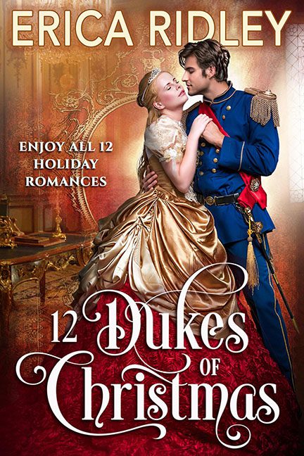
Let’s begin with the royal couple. At first glance, they’re embracing in a tender, passionate clinch. But look closer, and the illusion melts faster than eggnog in July. Our hero, Prince Discount-Napoleon, and his golden-draped duchess are clearly cut and pasted into the scene from an entirely different photoshoot. Their crisp, high-res presence absolutely refuses to acknowledge the blurry, low-resolution background, which appears to have been dragged in from a Victorian Castle Screensaver Starter Pack.
Then there’s the lighting. Or rather, the absence of any coherent lighting strategy. The window on the right blazes with imaginary sunlight, casting glorious… nothing. No rim light on the characters. No glow on their shoulders. No highlights on the floor. The scene is lit like a studio portrait session awkwardly held in front of a poorly printed Renaissance backdrop.
And about that backdrop — is that a mirror, a window, or a floating frame leading to the shadow realm? It’s geometrically questionable, spatially disorienting, and apparently immune to the laws of reflection. Like the rest of the background, it exists in a dimension where logic goes to die — probably alongside the other eleven dukes.
Typography time. The title “12 Dukes of Christmas” is written in a font so frilly and florid it could only have been chosen by someone who asked, “How many decorative curls can we add before it becomes completely illegible?” The answer was “just one more.” Combine that with all-caps serif for the author name, basic sans-serif for the tagline, and suddenly we’ve got three fonts dueling for dominance, none of whom are winning.
The final effect is a romance cover doing the absolute most — and yet achieving the absolute least in visual harmony. It’s as if someone grabbed royalty, Christmas, Photoshop, and a heavy dose of glitter, threw them in a snow globe, shook it violently, and called it a day.
So yes, enjoy all 12 holiday romances — but please don’t let this cover be your first impression. Because while there may be twelve dukes, there’s exactly zero design sense.
