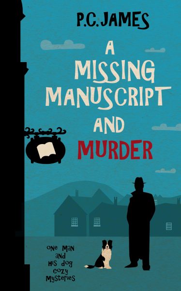
Another Cozy Mystery Cover That’s a Little Too Cozy
Sometimes a cozy mystery cover wraps you in a warm blanket of charm and intrigue. And sometimes… it wraps you in clip art and questionable font choices. Today’s entry is brought to you by the fine folks who apparently used the design tools available on a mid-2000s cereal box contest submission.
Let’s break it down:
-
Typography Trauma: The title stumbles between fonts like a drunk uncle at a wedding. “MURDER” is in red, presumably to emphasize danger — but it lands more like a passive-aggressive label from a kid’s Halloween costume.
-
Color Scheme Soothing Us to Sleep: Soft blues and flat silhouettes might scream “low-stakes mystery,” but they also scream “please add contrast.” The hills and buildings bleed into each other like an overambitious watercolor tutorial.
-
Our Leading Man… Or Is It a Lamp Post?: The black silhouette of the detective (?) is less “enigmatic sleuth” and more “cardboard cutout abandoned at a library fundraiser.”
-
The Dog Is Trying Its Best: There is a dog. He is good. He deserves a better cover.
-
Title-To-Image Disconnect: “A Missing Manuscript and Murder” promises mystery and maybe a dash of thrill. Instead, we get a Windows 95 screensaver with a side of pet obedience school branding.
Final thoughts? It’s not the worst cozy mystery cover we’ve seen (shout out to Murder at the Bingo Hall and the Mismatched Fonts), but it’s certainly one that could benefit from a little design TLC and a lot more personality.
