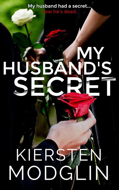
There are bad covers, and then there are covers that look like they were generated by a checkbox labeled “Domestic Thriller Starter Kit.” My Husband’s Secret falls squarely into the latter category—a grim, joyless mashup of stock photography, aggressive typography, and genre clichés so tired they look like they’ve already attended the funeral pictured on the cover.
Let’s begin with the image, which is peak stock photo overuse. Hands holding roses at what is clearly a funeral scene: dark clothing, blurred figures, solemn vibes. This exact photo—or one of its 47 siblings—has appeared on approximately every thriller, suspense, and “shocking secret” novel published in the last decade. There’s nothing wrong with stock photos in principle, but this one has been wrung dry. It’s not evocative; it’s predictable. You don’t feel intrigue—you feel like you’ve seen this cover while scrolling past twelve others just like it.
Then there’s the composition, which can only be described as “text-first, image-last.” The title is slammed across the center in bold, all-caps white type, slicing straight through the image like a blunt instrument. No finesse. No interaction with the photo. Just brute-force placement. The words obscure hands, roses, and visual flow, turning what could have been a moody image into a background texture for typography that refuses to cooperate.
And oh, the typography. This is a full-on typography crime scene. The font is a generic, modern sans serif that has been used on everything from crime novels to tech brochures. There’s no personality, no nuance, no reason for this specific font to exist on this specific cover—other than it was available and bold enough to shout. The apostrophe in “HUSBAND’S” looks like it’s fighting for its life, and the line breaks feel arbitrary, as if chosen by someone who stopped caring halfway through.
Hovering above all of this is the tagline: “My husband had a secret… now he’s dead.” Rendered in red, because of course it is. Red text for danger. Red text for blood. Red text for subtlety’s funeral. It’s small, poorly contrasted, and visually disconnected from the rest of the design. It doesn’t intrigue—it spoils the mood by bluntly announcing the premise like a tabloid headline taped to the top of the cover.
The author name at the bottom fares no better. It’s clean, readable, and completely uninspired, floating there as if hoping no one will associate it too closely with what’s happening above.
This cover isn’t terrible because it’s chaotic or messy—it’s terrible because it’s soulless. It’s a checklist, not a design. Funeral photo? Check. Big white title? Check. Red danger text? Check. Emotional manipulation via roses? Double check.
My Husband’s Secret doesn’t whisper suspense. It shouts cliché. This isn’t a mystery—it’s a template wearing a black dress, and it absolutely earns its place in the Horrible Covers archive.
