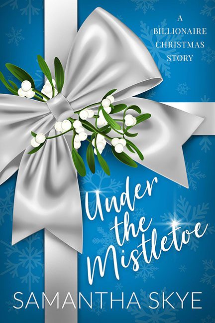
What happens when a billionaire holiday romance gets gift-wrapped by a bored intern with access to Microsoft Publisher and a discount clipart library? You get Under the Mistletoe by Samantha Skye — a festive design catastrophe that looks less like a steamy seasonal read and more like a mall gift card display.
Let’s start with the elephant-sized silver bow in the room. This thing isn’t a ribbon, it’s a metallic fabric monster, devouring the entire layout like it’s auditioning for a role in Attack of the Killer Gift Wrap. It dominates the composition so aggressively, we’re not even sure there’s a book under there. And for something so large, it brings absolutely nothing to the table — no texture, no dimension, just a flat, digitally smoothed eyesore that gleams like a badly rendered sheet of tinfoil.
Nestled into this disaster is a sprig of mistletoe that looks like it was dragged and dropped as an afterthought. It floats in a weird, shadowless vacuum like it’s questioning its own life choices. Are we meant to kiss under this thing or report it to plant services?
And then we get to the title, Under the Mistletoe, which is ironically placed entirely beside the mistletoe, not under it. The script font attempts festive whimsy but falls into chaotic energy instead. It’s too big for the space, awkwardly stacked, and looks like it’s trying to squeeze past the bow without drawing attention to itself.
The background is a blizzard of missed opportunities — generic blue with snowflake patterns that feel more like they belong on a roll of toilet paper labeled “Winter Soft.” There’s no sense of depth, no atmosphere, and not a single hint of billionaire luxury. This is supposed to be opulence wrapped in romance, not a gift from the clearance bin at a holiday warehouse store.
And let’s not ignore the ultimate corporate cringe slapped in the corner: “A Billionaire Christmas Story.” It’s the literary equivalent of a buzzword salad — bland, uninspired, and clearly there to hit every keyword algorithm possible.
In summary: this cover is the visual equivalent of re-gifting — it’s generic, joyless, and no amount of shiny ribbon can disguise the fact that it’s the design equivalent of fruitcake. Unwanted, unloved, and destined for the recycling bin.
Happy holidays… now take this thing off my shelf.
