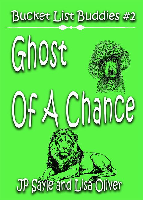
This cover arrives in an electric, retina-stripping green so bright it could guide lost ships to shore. If colors had personalities, this one would be an overcaffeinated highlighter screaming, “LOOK AT ME!” And you know what? You do look at it — and instantly regret it. The background alone qualifies this cover for witness protection, but the real horror story begins when your eyes adjust enough to see the rest.
Front and center — well, actually, sort of drifting around with no real direction — is a set of clip art fugitives: a poodle with the world’s saddest perm and a lion who looks like it just heard someone explain the plot of this book. These two grayscale refugees from a 1980s rubber stamp catalog are plopped onto the page with zero blending, zero logic, and zero attempt to connect them to the title. The poodle floats near the top like a ghost who died from embarrassment, while the lion lounges at the bottom, fully resigned to its fate as a decorative afterthought.
Now, the typography. Or perhaps more accurately, the typographical crime scene. The font recalls early-2000s Halloween party flyers — wobbly, stretched, and dripping with a drop shadow thicker than the plot of any soap opera. The words “Ghost Of A Chance” are scattered down the page like someone was tossing alphabet noodles onto a hot green wall. There’s no alignment, no spacing intention, just text existing in awkward limbo, trying desperately to look spooky while being utterly defeated by the blinding background.
And then we have “Bucket List Buddies #2” perched at the top, using a font that appears to have wandered in from a different, equally questionable cover. A decorative divider sits beneath it, doing absolutely nothing except confirming that someone, somewhere, discovered the “shape” tool and decided today was the day to unleash it.
Let’s take a moment to consider theme. The title mentions “Ghost.” The images show… a poodle and a lion. The lime green choice suggests “children’s slime toy packaging.” The fonts suggest “haunted carnival run by interns.” The result is a chaotic mashup that looks less like a cohesive book cover and more like a ransom note assembled by someone who only had access to clip art and neon poster board.
This isn’t just a horrible cover. This is a full-blown, lime-green fever dream in design form — a cover so baffling that even the poodle looks like it’s trying to fade itself into the afterlife to escape the layout.
