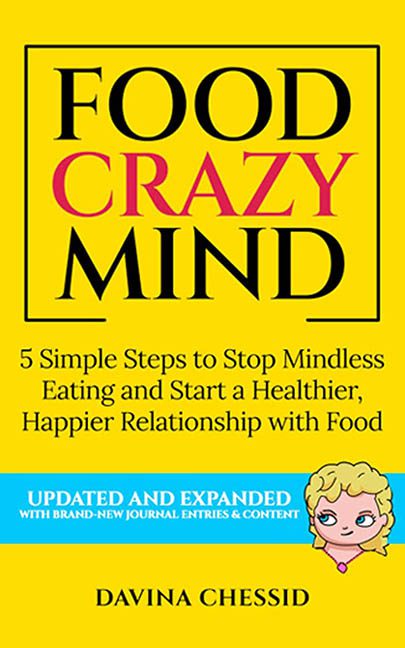
Here it is — Food Crazy Mind, a book cover that screams “I help people with emotional eating” while visually resembling a flyer for a broken vending machine hotline. This isn’t just a cover. It’s a visual panic attack in yellow — the kind of design that makes your eyes squint, your soul wince, and your inner designer cry out, “No more bevel effects, I beg you.”
Let’s start with the color — a radioactive, highlighter-yellow backdrop that feels like it was chosen not for readability, but for its ability to cause instant pupil dilation. It’s the color of warning signs, lost sticky notes, and caution tape — which, to be fair, may be the most honest part of this design. The cover is indeed hazardous, just not in the way the author intended.
Now onto the title: FOOD CRAZY MIND, three words arranged like they each came from a different book and only just met. “FOOD” and “MIND” are clinging to a Times New Roman-ish serif with the last shreds of dignity, while “CRAZY” bursts through the middle in bold red font like it just remembered it left the oven on. The spacing is tense. The emphasis is weird. The font weight screams “no one proofed this before exporting to PDF.”
Below that, the subtitle gives us the ultimate self-help salad:
5 Simple Steps to Stop Mindless Eating and Start a Healthier, Happier Relationship with Food
It’s so corporate it might as well be followed by a pie chart. This isn’t a subtitle. It’s a LinkedIn post waiting to happen. No emotion, no nuance — just a word cloud of TED Talk leftovers and healthy-living buzzwords stacked like limp lettuce.
But wait — what’s that in the bottom-right corner? A charming graphic? An elegant logo?
Nope. It’s a clip art cartoon head peeking out like your weird aunt who insists on photobombing every family picture. With a coy smile and mascara that’s doing its best, this floating blonde enigma has absolutely nothing to do with the content, tone, or typography. She’s just… there. A lurker in the design void. A digital paper doll interrupting a beige PowerPoint.
As if things weren’t cluttered enough, the cover also boasts a bright blue banner with the words UPDATED AND EXPANDED in all caps — an announcement so loud it drowns out the actual title. It’s like the book is yelling at you for not buying it sooner.
And somewhere down at the bottom sits the author’s name — DAVINA CHESSID — looking small, unsure, and probably wondering what it did in a past life to end up sandwiched between a screaming promo bar and a smug cartoon face.
In the end, Food Crazy Mind is less “helpful guide” and more “graphic design anxiety simulator.” It’s what happens when self-help meets WordArt and nobody intervenes. If design is supposed to reflect clarity and balance, this cover offers the exact opposite: a chaotic buffet of bad choices served under a neon heat lamp.
