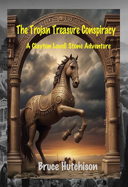
The Trojan Horse may have been history’s greatest trick, but this book cover is modern graphic design’s greatest tragedy. The Trojan Treasure Conspiracy rides into view looking less like a thrilling archaeological adventure and more like a Photoshop workshop final project that got a C+ for effort and a note that said, “Please use fewer filters next time.”
Let’s start with the main event: the Trojan Horse. Standing heroically beneath a stone arch, it appears mid-stride — or at least it was, before its left hind leg mysteriously vanished into the background like it owed money to the rendering engine. One leg is proudly galloping into battle, while the other has fully ghosted the scene. This isn’t foreshadowing a mystery — this is accidental amputation via bad compositing. Somewhere, a Centaur is filing a lawsuit for copyright infringement and emotional distress.
And speaking of compositing: what is this setting?
We’ve got an ultra-detailed horse statue, pasted into a Romanesque arch that’s floating in front of a smudgy AI-dreamscape of clouds, ruins, and desert haze. The lighting across the horse, arch, and background doesn’t match — and that’s being generous. The sun is somewhere offscreen. Possibly several suns. Or maybe a ring light. Who knows? The whole thing looks like different stock assets were stitched together in a frantic last-minute design dash, then wrapped in a color correction filter labeled “Dramatic But Muddy™.”
Now brace yourself for the typography, because this is where the real conspiracy lies.
-
The Trojan Treasure Conspiracy is in bright yellow Comic Sans energy, floating across the top like it’s trying to sell discount tickets to a sword-and-sandal puppet show.
-
A Clayton Lovell Stone Adventure is crammed directly below it, also in yellow, as if to clarify that yes, this is both an adventure and a formatting problem.
-
At the bottom, Bruce Hutchison’s name sits in a bold white font that looks like it got lost on its way to a toothpaste box. It’s too soft for an adventure thriller, too bright against the muddy background, and clearly added without any concern for balance or style.
And then there’s the framing. The arch is centered, yes — but it creates a bizarre visual tunnel that leads your eye to… nowhere. There’s no focal point beyond “look, a horse,” and the surrounding landscape is so flat and textureless that it feels like a low-res dream sequence from a forgotten educational CD-ROM.
In the end, The Trojan Treasure Conspiracy wants to be thrilling, ancient, and epic — but instead delivers a visual riddle that even Homer couldn’t make sense of. A disappearing leg, clashing layers, cursed fonts, and all the subtlety of a scroll slapped with a neon highlighter. It’s not a cover. It’s a warning: beware of Greeks bearing poorly designed JPEGs.
