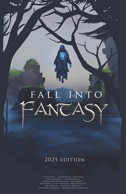
“Fall Into Fantasy,” they said. And fall it did — directly into the uncanny valley, bouncing off every branch of Photoshop purgatory on the way down.
Let’s start with the star of the show: the floating specter of stock asset regret. Hovering like a confused ghost waiting for someone to tell it where the audition line is for Scooby-Doo, this hooded blue figure looks less like a mysterious fantasy entity and more like the IT guy from beyond who hasn’t updated his cloak since Windows 95. The glow effect? Pure clip art chic. It’s not casting light. It’s not casting shadow. It’s just… there, like your ex’s Netflix login — still haunting you for no reason.
Then there’s the background, which appears to have been cobbled together from three separate fantasy starter kits. Misty cliffs! Calm lake! Vector tree silhouettes from a completely different art style! The composition is less cohesive than a Dungeons & Dragons campaign run by six players who all refuse to agree on the setting.
Speaking of those trees: the foreground branches form a dramatic arch, framing the ghostly figure like it’s the long-lost mascot of a Halloween-themed nature park. But the stark, flat silhouettes clash so hard with the soft, painterly background that it feels like two entirely different design interns got into a passive-aggressive Canva battle and no one won.
Now, the typography. Ah yes — nothing screams “epic fantasy” like a generic fantasy font with oddly stubby sword tips for serifs, paired with a subtitle that looks like it was written in Arial, centered with trembling fingers, and given all the enthusiasm of a tax form. “2025 Edition” floats at the bottom like a warning label. And the lineup of author names? Crammed at the bottom in microscopic text like they’re trying to sneak past without being associated.
Let’s be honest: this cover doesn’t whisper mystery or epic journeys. It doesn’t promise high adventure or magical realms. No, it screams “group project that fell apart when the lead designer quit and someone’s cousin finished it in Canva.”
It’s not all hopeless — there’s atmosphere in there somewhere, buried under the spectral sticker, disjointed layers, and design decisions made under the influence of a dying battery. But this isn’t a gateway to fantasy. It’s a reminder that when every design choice competes with the next, the only thing that truly falls… is the cover itself.
