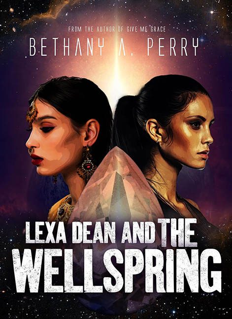
In the vast reaches of the cosmos, where stars burn bright and narrative potential stretches across galaxies, one cover boldly ventures into the outer limits of design confusion. Welcome to Lexa Dean and the Wellspring — a title that promises celestial mystique but delivers an aesthetic best described as “Cosmic Filter Fail meets Font Crisis 9.”
Let’s begin with the portraits — our two leading ladies, staring stoically in opposite directions like they’re auditioning for a Soap Opera in Space that got canceled mid-pilot. Except, instead of strikingly rendered characters, we’re treated to what happens when you run high-res photos through a vector filter on maximum setting and call it a day. Their skin textures have been boiled down to waxy gradients, their facial features softened into Play-Doh territory, and the hair? A clumpy, smudgy afterthought. It’s not stylized. It’s not painterly. It’s just… uncanny, like someone tried to turn a photo into a poster with a glitching phone app.
And then there’s the Crystal of Confusion front and center — a giant, faceted rock parked between the women like a metaphysical coffee table. Is it the Wellspring? Is it a space egg? Is it holding their friendship together through the power of quartz? We may never know, because the lighting on it doesn’t match anything else, and it floats in space like a 3D asset that escaped from an astrology-themed mobile game.
The background is standard-issue stock galaxy — sparkles, gradients, vague nebula swirls — sprinkled in to give the illusion of sci-fi scope. But it doesn’t integrate. It doesn’t elevate. It’s just wallpaper behind a design that’s already falling apart in the foreground.
But the real black hole is the typography.
Let’s start with the title: LEXA DEAN AND THE WELLSPRING — bold, distressed, and completely tone-deaf. This font belongs on the side of a shipping container or maybe the poster for a zombie trucker movie. In the context of mysticism and cosmic forces? It’s about as subtle as carving it into a meteorite with a chainsaw. The texture is gritty and raw, clashing spectacularly with the softened, over-filtered characters and spacey backdrop.
Above that, we have “Bethany A. Perry” floating in a thin, awkwardly spaced typeface that’s trying to be sci-fi but ends up looking like a menu option in a dated video game. The bizarre decision to put dots before and after the name adds nothing but visual clutter — unless they’re meant to be interstellar punctuation, in which case… still no.
In the end, Lexa Dean and the Wellspring is a cosmic misfire. It has ambition, yes — but every design decision pulls in a different direction: posterized faces, a floating space rock, and genre-clashing fonts that scream louder than the stars. It could’ve been a sleek celestial journey. Instead, it’s an awkward galactic yearbook photo from the school of Design Gone Rogue.
