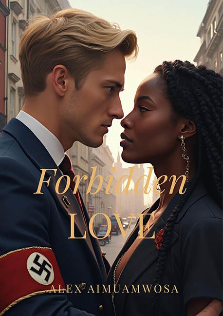
This isn’t “forbidden love”—this is graphic design felony with historical amnesia and a soft-focus Instagram filter. If the goal was to create the most tone-deaf romance cover in the history of the genre, then congratulations: it’s a five-alarm aesthetic dumpster fire with a swastika armband delicately placed on top.
Let’s begin where the eyes immediately go: the Nazi uniform. Because nothing says “romantic longing” quite like a symbol of genocide Photoshopped into a tender embrace. This isn’t provocative—it’s promotional material for a Hallmark Channel fever dream accidentally greenlit by a time traveler with no moral compass. The Nazi aesthetic has been rebranded here as a fashion statement, complete with dreamy lighting and a golden-hour glow, like we’re supposed to forget this imagery represents one of history’s darkest chapters. It’s jaw-dropping in its carelessness.
Then there’s the couple’s pose. Nose to nose, lost in each other’s eyes, mid-1940s street scene behind them—every visual choice screams stock romance. But the problem is, you can’t slap a Harlequin pose on fascism and call it a concept. The emotional dissonance is staggering. It’s like watching a Nicholas Sparks movie suddenly detour into a war crime tribunal.
Now, let’s dig into the typography—or, more accurately, the beige word soup masquerading as a title. “Forbidden Love” is delivered in the most generic, unstyled serif font available, dropped onto the characters’ faces like it wandered into the composition and forgot to leave. The author’s name, rendered in a gold-on-gold whisper, is practically invisible—perhaps a subconscious plea to avoid association. Either way, it’s typographic negligence.
And let’s not ignore the AI-generated vibes of the whole image. Everyone’s skin looks like polished wax, the lighting doesn’t quite belong to any time of day, and the fabric behaves like a shy simulation of real-world cloth. This isn’t historical fiction—it’s Midjourney’s misunderstanding of human emotion filtered through a romance novel cliché generator.
Even the composition is suspect. Everything is centered with all the subtlety of a sledgehammer, which works wonders if you’re designing a poster for a school play about Romeo and Juliet in Nazi Germany (note: please don’t). The visual hierarchy is nonexistent, the tone is completely unmoored from its subject matter, and the result is less “bold artistic statement” and more “banned Kindle cover.”
This is not a boundary-pushing cover—it’s a train wreck of poor taste and worse design. If this was meant to spark conversation, it does—but the conversation is mostly, “How did this get past every level of editorial review without someone unplugging the design software?”
Verdict: Forbidden? Absolutely. This cover should be forbidden from printing presses, digital platforms, and polite society.
