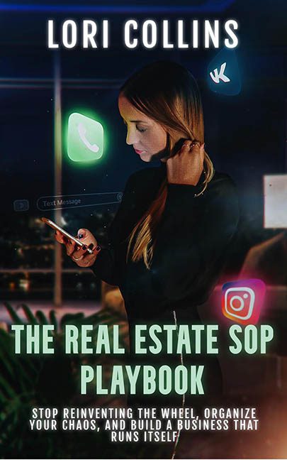
This cover is what happens when a Canva template chugs five espressos and tries to become a business guru overnight. “The Real Estate SOP Playbook” promises organization and streamlined operations—but visually, it’s a masterclass in digital chaos. The only thing being automated here is bad design.
Let’s begin with the central figure: a distracted businesswoman lost in thought, gazing into her phone like she’s just remembered she left the oven on in 2017. She’s surrounded by floating app icons—WhatsApp, Instagram, VK (sure, why not)—hovering like the ghosts of productivity tools past. These glowing glyphs aren’t integrated; they’re just slapped on with the urgency of a last-minute group project, glowing like radioactive marshmallows in a UX developer’s fever dream.
This isn’t visual metaphor—it’s visual meltdown.
Now, about the typography. The title “THE REAL ESTATE SOP PLAYBOOK” is stacked with all the grace of cinder blocks falling down a stairwell. There’s no hierarchy, no finesse, just capital letters shoved into place like they’re being punished for something. The green-ish mint colour is trying to pop off a moody, hyper-filtered background and instead ends up looking like expired toothpaste. A drop shadow tries to save the day, but instead just makes it all look fuzzier—like the text is experiencing motion sickness.
And then there’s the subtitle. Oh boy. It reads like someone copy-pasted their LinkedIn About section directly onto the cover:
“Stop reinventing the wheel, organize your chaos, and build a business that runs itself.”
Inspirational? Possibly. Exhausting? Definitely. It’s the kind of motivational poster you’d find in a coworking space bathroom, right next to a QR code for a startup pitch deck. There’s no spacing, no structure—just a dense brick of marketing jargon weighed down by its own ambition.
What’s entirely missing, however, is any visual indication that this is about real estate. There’s no house, no blueprint, no hint of property or operations or even a casual nod to buildings. Unless this is about selling digital condos inside WhatsApp, the imagery is wildly off-brand.
And the lighting? It’s like someone threw a flashlight at a filter pack and called it ambience. The shadows make no sense, the colour grading leans into Matrix green for no apparent reason, and the whole vibe feels like a crime thriller promo crossed with an e-coach’s Instagram reel.
This isn’t a systemized professional cover—it’s the visual equivalent of throwing sticky notes at a wall and calling it a strategy. If this playbook really runs itself, it must have sprinted straight past the design phase.
Verdict: Organize your chaos? Start with this cover. It’s not SOP—it’s SOS.
