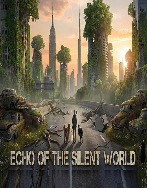
Ah yes, Echo of the Silent World—where the world has ended, humanity has vanished, and apparently so has any understanding of depth, perspective, or terrain consistency. This cover wants to be a haunting post-apocalyptic epic, but instead it serves up the visual equivalent of a synthetic fever dream filtered through a broken photo editor.
Let’s start with the initial illusion: a strikingly symmetrical road leading into the distance, flanked by crumbling buildings and rusted-out vehicles overtaken by nature. But give it a second look—and suddenly, the apocalypse starts falling apart like wet cardboard.
The cars? Surprisingly, not cut-and-pasted. But the real MVP of the visual collapse? That cliff drop-off at the start of the road, right in the foreground. It’s clearly been slapped in post like a dramatic exclamation mark, screaming, “Danger starts here!”—but all it really does is break the terrain completely. There’s no logical transition between road and rubble. It’s like the ground got tired of existing and gave up halfway through rendering.
And about that road: the further you look, the worse it gets. The foreground stretches like taffy in an AI blender. Cracks and roots ripple outward in a bizarrely flattened, melted perspective, giving the whole thing the feeling of a digital slip ‘n slide into uncanny valley. It’s not depth—it’s warped dimension cosplay.
Now let’s talk environmental logic, or the complete lack thereof. The buildings are overgrown, the cars are crusty with moss—but the center of the road? Cleaner than a theme park sidewalk. No vines, no grass, not even a weed. The apocalypse has come, but someone’s still out there with a pressure washer. The plants only grow where they make the composition look dramatic, not where they would naturally take over. This is visual overgrowth by interior decorator.
And then… the character. A lone humanoid rabbit (sure), striding confidently down the cracked asphalt with two loyal dogs like this is Watership Down: The Last of Us Edition. The concept could work—if it weren’t dropped like an afterthought into a scene with no tonal setup. Are we meant to take this seriously? Because the cover plays it deadpan while serving full furry-on-a-journey energy, and no one seems to have made a decision about whether it’s satire, metaphor, or weird-for-weird’s-sake.
The font? Functional. It’s doing the bare minimum—distressed, post-apocalyptic block text, slapped on like a patch over a leaking narrative. At least it’s legible, unlike the background’s sense of physical law.
Verdict: Echo of the Silent World tries to sound haunting, but the only thing echoing here is the desperate cry of Photoshop being misused. This isn’t a ruined city—it’s a scavenged mess of AI ambition and compositional collapse.
The silent world may be quiet, but this cover is screaming.
