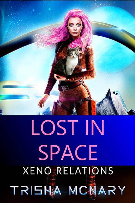
Welcome to the visual black hole of Lost in Space: Xeno Relations, where genre meets glam in a full-frontal collision with poor design decisions and a stray cat. This cover is not so much lost in space as it is trapped in a design wormhole, where gravity, logic, and Photoshop layer masking no longer apply.
Let’s begin with the cover star, who struts out of what appears to be a 1997 deep-space fashion editorial—but make it clearance bin. Our heroine is clad in a skin-tight orange suit, gripping a house cat like it’s the alien love interest the title forgot to introduce. Her hair, a blazing cotton candy pink, defies the laws of physics, gravity, and taste. It looks less like “galactic seductress” and more like “drag show malfunction in a wind tunnel.”
Now the cat. Oh, the cat. Not a space cat. Not an alien feline. Just a regular old domestic tabby looking deeply unsure how it ended up in the arms of a neon-haired astronaut in the middle of an icy CGI moonscape. The lighting on the cat is completely different from the lighting on the woman, which is completely different from the lighting on the sky, which is—surprise!—completely different from the lighting on the mountain range. We are in Layer Misalignment: The Musical and everyone is singing off-key.
Hovering in the background are some vaguely futuristic ship-like smears, which look like they were drawn on with a stylus by someone three drinks into a synthwave playlist. They aren’t flying so much as lurking, waiting to be erased. If there’s a narrative here, it’s trapped in a visual Bermuda Triangle.
Let’s talk typography, which appears to have been assembled in panicked stages. “LOST IN SPACE” is jammed between colour blocks like someone hit enter one too many times. “XENO RELATIONS” is in a different font, because consistency is for cowards. And “TRISHA MCNARY” glows like the neon sign of a dive bar on Mars. It’s unclear what the mood is supposed to be—romance, camp, sci-fi, YA—but the cover gives us all of it, slathered in saturation and dashed with regret.
To top it off, the color blocking at the bottom looks like it was added to hide a formatting mistake. The figure’s legs awkwardly vanish into it like she’s being absorbed by a PowerPoint transition effect. It’s not grounding the character; it’s erasing her shins.
Verdict: This isn’t just Lost in Space—it’s lost in genre, lost in design, and absolutely lost in execution. Between the slapped-in stock cat, the over-filtered heroine, and the typography salad, the only thing this cover lands is a spot in the Galactic Hall of Design Shame.
Houston, we have every problem.
