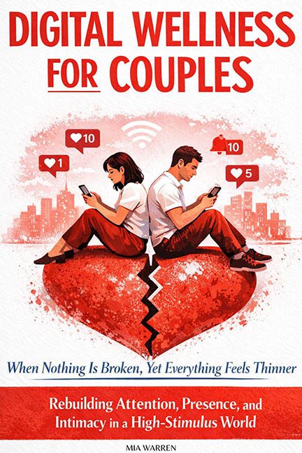
There’s a special place in the bad book cover multiverse reserved for Digital Wellness for Couples, and it’s somewhere between a wellness seminar pamphlet and a dating app cautionary tale. If love is a battlefield, this cover is the badly drawn map that gets you lost in the first 5 seconds.
Let’s start with the central image: two sad millennials glued to their phones, perched on what appears to be a split heart the size of a small country. We get it — modern romance is fractured by screens — but must you illustrate it like a middle school anti-texting poster? The heart is bleeding symbolism (and also, just… bleeding), while the couple appears to have been rendered in clip-art purgatory, their souls replaced by unread notifications.
And then there’s the typography — a tragic tale of fonts gone rogue. The main title “DIGITAL WELLNESS FOR COUPLES” screams in all caps like it’s yelling at you across a wellness retreat parking lot. The red-on-white combo is aggressive, but not in a “set boundaries” kind of way — more like a “printed this at Office Depot” vibe. Then the subtitle arrives in a jarring italicized serif font, which feels like it wandered in from a completely different book — possibly one about civil war romance. And let’s not ignore the weird hierarchy salad happening further down. Blue italics, red bold, and an extra helping of lowercase guilt all fighting for dominance like neglected love languages.
The background is a wash of cityscape squiggles, like someone tried to do Westworld but ran out of budget and had to settle for ClipArtopolis. Floating Instagram-like notifications hover above the characters’ heads, in case you missed the point (spoiler: you didn’t). There’s a literal Wi-Fi icon radiating out of their disconnection — subtlety officially left the building.
It’s not just that this cover is ugly. It’s that it’s the wrong kind of ugly: the kind born from a good idea trapped inside an awkward design tool. It’s the result of someone yelling “make it modern!” while forgetting that modern doesn’t mean emotionally sterile and visually chaotic.
In the end, Digital Wellness for Couples visually delivers exactly what its title promises: the cold, cracked heart of two people trapped in a high-stimulus aesthetic disaster, drifting apart in a sea of notification bubbles and uninspired design choices. If you’re seeking intimacy, start by swiping left on this cover.
