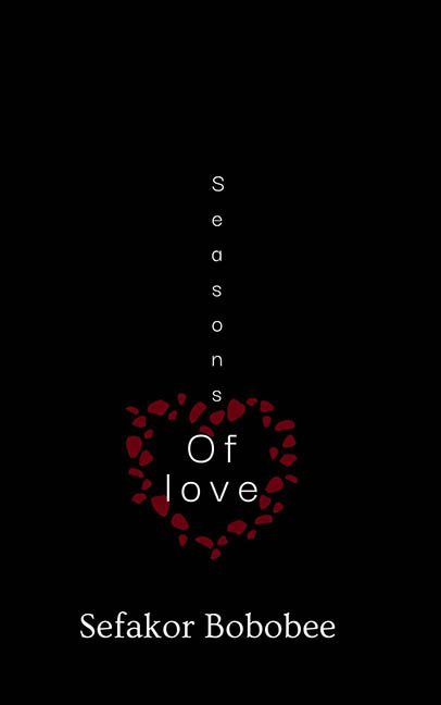
Minimalism is a delicate art. When done right, it whispers elegance and emotional clarity. When done wrong, it just whispers, “I made this in Microsoft Word and forgot to centre it.” Seasons of Love by Sefakor Bobobee sets out to be poetic and understated—but lands somewhere between “greeting card mock-up” and “design class dropout.”
Let’s begin with the layout, which can only be described as vertical regret. The word “Seasons” is stacked letter by letter in a default sans-serif font like it’s clinging to the edge of the page for dear life. Then, in a bold creative leap—or perhaps a stumble—we descend into “Of love,” floating in the middle of a red heart made out of what appear to be flower petals… or drops of blood… or maybe clipped punctuation from a Word document that didn’t make it.
And that’s the problem. The heart shape is so vaguely assembled, it looks like it could be romantic debris from a broken Valentine’s Day printer. The attempt at symbolism is clear—love in pieces, perhaps? The seasons changing? But with zero visual cues to represent spring, summer, fall, or anything beyond “leftover vector blobs,” the metaphor fizzles into graphic mush.
Now let’s talk typography, or what little of it there is. This cover is a masterclass in doing the absolute minimum with your font. No style variation. No hierarchy. No thought given to kerning, weight, or impact. Just lowercase sans serif set into place like someone dragged it into position and said, “Good enough.” Spoiler: it wasn’t.
Then there’s the negative space situation, which is not so much “elegant restraint” as it is “didn’t finish the design.” The top half of the cover is a yawning black void, the kind of emptiness that makes you check if your screen is loading. Meanwhile, the author’s name is anchored all the way at the bottom, looking as lonely as the title does confused.
Even the concept falls apart under closer scrutiny. Seasons of Love implies emotional evolution, change, perhaps even time. But there’s nothing seasonal here. No warmth, no chill, no transformation. Just floating text and a heart-shaped placeholder gasping for design relevance.
In conclusion, this isn’t a minimalist masterpiece—it’s a romantic concept stranded in formatting purgatory. Seasons of Love wanted to be deep. It wanted to be visual poetry. Instead, it’s just a vertical accident with a punctuation rash and an existential font crisis.
Call it love if you must—but there’s no season where this cover works.
