In an alternate universe, “Fallout of War” is a gripping, hard-hitting exploration of conflict’s aftermath. But here in our visual reality, it’s the result of someone discovering the “Insert Text” tool in Microsoft Publisher and declaring themselves a graphic designer before lunch.
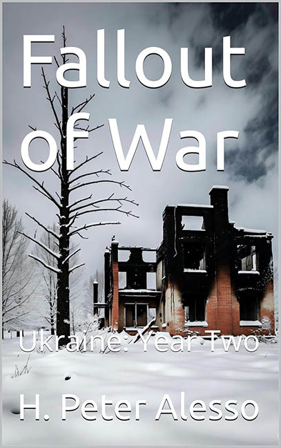
Let’s begin with what this cover thinks it’s doing: dramatic wartime minimalism. A burned-out building in a snowy field, stark and somber, might seem like a fitting image to portray the devastation of war. Unfortunately, the execution is so monumentally lazy it undermines every ounce of emotional gravity the subject matter deserves.
The title, “Fallout of War,” is set in what appears to be plain Arial—or some other off-the-shelf sans-serif font so generic it might as well be the typographic equivalent of plain toast. No kerning. No hierarchy. No effort. Just big white letters floating awkwardly over the scene like an afterthought—or perhaps an intern’s first attempt before realizing they left their mouse cursor in the middle of the image.
Now, let’s talk layout. The title awkwardly intersects a dead tree like it’s being crucified on the altar of bad design. There’s no visual balance, no awareness of how to frame the focal point, and definitely no understanding of spacing. “Ukraine: Year Two” is relegated to the snow, barely legible, fading into the foreground like the designer hoped it might disappear before anyone noticed how bad it looked.
And the author’s name? Plopped at the bottom like it’s embarrassed to be part of this mess. It’s too big for subtlety, too small for impact, and so disconnected from the rest of the design that it might as well be walking away from the burning building in the background.
The worst part? The photo is actually quite strong. A talented designer could have made this haunting, poignant, even cinematic. But instead, it was sacrificed to the gods of zero-effort book covers. No blending. No colour grading. No contrast correction. No attempt to match the tone of the text with the image’s emotional weight. Just a bleak photo ruined by beige effort.
In short, this isn’t a war memorial—it’s a war crime against visual communication. “Fallout of War” doesn’t fall; it collapses under the weight of its own design apathy. A serious subject reduced to template-level design choices and zero emotional impact. If ever there were a cover that needed a ceasefire from bad typography, this is it.