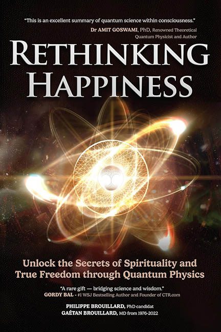
If you’ve ever wanted to unlock the secrets of the universe using clip art and confusion, Rethinking Happiness is your golden ticket to enlightenment—via design catastrophe. This cover isn’t just rethinking happiness—it’s actively dismantling it, one glowing particle at a time.
Let’s start with the visual centrepiece: an atom. A giant, fiery, lens-flared, emotionally unstable atom. Floating in the void, it glows like the sun, shoots off random beams of energy, and holds—because why not—a tiny tree of life inside its nucleus. Yes, nothing says “quantum physics meets spirituality” quite like a CGI hydrogen atom that looks like it’s about to launch a TED Talk on inner peace and interdimensional gardening.
But wait—there’s more. The design doesn’t stop at one overused metaphor. It throws in stars, orbs, faint galaxies, motion blur, and unidentifiable glowing blobs until the whole thing feels less like a book cover and more like a cosmic screensaver from a 2004 meditation app.
Now onto the typography, which is locked in a chaotic quantum superposition of styles. The title, “RETHINKING HAPPINESS,” is rendered in a chunky serif font so grandiose it looks like it wandered in from a medieval fantasy novel. Beneath it, a subtitle appears in italicized, glowing purple, because nothing says scientific credibility like Unlock the Secrets of Spirituality and True Freedom through Quantum Physics in the exact shade of a vape store sign.
Then come the blurbs and credits—stacked like a citation traffic jam:
-
A quote from a theoretical physicist.
-
A generic praise nugget from a Wall Street Journal bestselling author.
-
Author credentials—twice—because one PhD candidate wasn’t enough, apparently.
Each piece of text is fighting for real estate on the cover, with no spacing strategy, no typographic hierarchy, and certainly no mercy. It’s like they’re all part of a group project and no one agreed on a font.
And let’s not ignore the overall tone clash. The title suggests a mindful reflection on joy. The imagery? A particle accelerator exploding at Burning Man. The typography? Fantasy book meets motivational poster meets… corporate wellness retreat brochure.
Rethinking Happiness wants to be profound, but it’s mostly just profoundly confusing. It looks like the end result of someone Googling “quantum spirituality cover design” and combining every result into a single, glowing, genre-confused vortex.
In the end, this cover doesn’t rethink happiness. It makes you rethink clicking “Add to Cart.” It’s not deep. It’s not wise. It’s not scientific. It’s just what happens when you hand a New Age philosophy to a particle physicist with access to After Effects and no design training.
