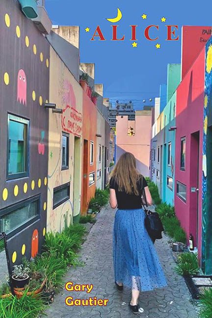
Somewhere in a whimsical alleyway between street art and severe design neglect lives Alice by Gary Gautier—a book cover that seems to ask the timeless question: “What if we used my vacation photo and just… went with it?”
Let’s start with the image, which clearly began life as a casual phone snapshot taken during a stroll through a charming, mural-filled neighbourhood. And to be fair, the alley’s Pac-Man ghosts and rainbow façades do have potential—if this were a travel blog, or a photo contest titled “Unexpected Urban Whimsy.” But as a book cover, it lands somewhere between “Instagram influencer backdrop” and “accidental real estate listing.” It lacks focus, atmosphere, and any attempt to communicate what Alice is actually about. Unless this is a story about someone wandering into a pop-art fever dream while looking for a smoothie shop, the visual metaphor is MIA.
Then there’s the mysterious figure of Alice, or perhaps Not-Alice, walking away from the camera like she’s ghosting the entire layout. Back turned, expression hidden, and framed dead-centre as if to say, “I, too, have no idea what this book is trying to say.” She’s dressed like a millennial time traveler lost in a Euro cafe strip, and while she might be a character, she could also be a tourist caught mid-shot. The cover makes no effort to tell us.
And oh, the typography. The title Alice floats at the top in a serif font that thinks it’s whimsical, but really just looks like it got bored halfway through typesetting. To add to the confusion, it’s surrounded by clip-art stars and a cartoon crescent moon, suggesting either a magical bedtime story or a graphic design intern’s first go at layering in Microsoft Publisher. The word “Alice” is styled like a children’s book—but the background image says “urban drama,” and the overall vibe says “accidental postcard.”
Let’s not forget the author’s name, shoved into the bottom left corner in bright yellow with a red stroke—a crime against contrast, readability, and good taste. It looks like the text from a 1999 “Coming Soon!” web banner, boldly clashing with the already chaotic colour palette and casually nested among the alley’s overgrown greenery.
No drop shadows. No texture blending. No attempt to unify the design elements. Just a raw photo, two disconnected fonts, and a handful of cosmic punctuation slapped together like a last-minute science fair poster.
In conclusion, Alice isn’t a book cover—it’s a lost tourist wandering through the genre section with no map, no plan, and no concept of visual storytelling. It doesn’t hint at plot, theme, or tone—it simply exists. Which, to be fair, is the same energy this design put into trying.
