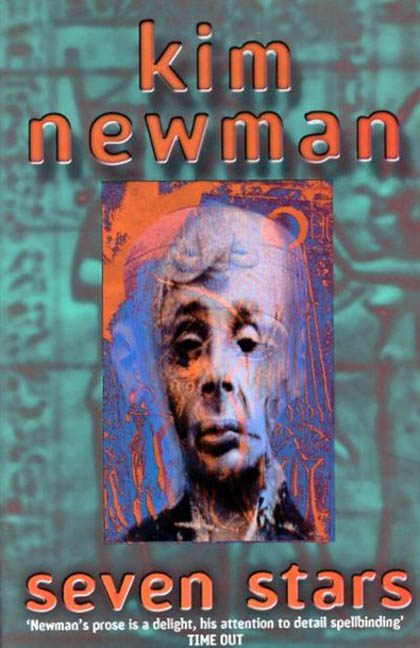
There’s experimental, and then there’s Seven Stars by Kim Newman—a cover that looks like it crawled out of an early-2000s Photoshop tutorial, fell into a haunted scanner, and was resurrected as a warning to future designers. This is not a book cover. This is a design séance gone terribly wrong.
At first glance, you might think your screen is glitching. You’re not having a stroke—the art actually looks like that. A distorted grayscale face smudged into a red-blue lava overlay, encased in a burnt-orange frame like a cursed postcard from the underworld. The face is stretched, warped, and completely unreadable in tone. Is it horror? Satire? Found footage of a wax sculpture mid-melt? Whatever it was meant to be, it’s now solidly filed under Why Was This Approved?
The background only deepens the confusion: a sickly teal-green texture that resembles faded wallpaper from an abandoned laser tag arena, overlaid with vague ancient Egyptian symbols that are just there—not integrated, not explained, just floating like confused hieroglyphic photo-bombers. It’s the design equivalent of someone whispering, “I heard you like lore,” and then running away before finishing the sentence.
Then we get to the typography—oh dear. The name “kim newman” is set in lowercase letters that appear to be extruded out of orange gelatin, complete with dated drop shadows and a gradient that looks like it was piped directly in from MS Paint’s “futuristic” font settings. The effect is less “horror author” and more “Nickelodeon Halloween Special.”
And the title, seven stars, is placed limply at the bottom in the same garish font, in all lowercase, blending into the chaotic visuals like it’s hiding from the rest of the design. It’s hard to read, impossible to enjoy, and visually squashed into a rectangle of colour chaos. It’s also accompanied by a critic quote shoved in like a footer on a ransom note, completing the “everything must fit somewhere, anywhere, just get it on the page” energy.
There’s no hierarchy. No cohesion. No genre clarity. The entire layout feels like a collage made by a haunted laminating machine that was fed horror tropes, historical trivia, and a heavy dose of JPEG compression.
Seven Stars could have leaned into ancient mysticism, or cosmic dread, or even pulp horror charm. But instead, it landed in the uncanny valley between “what am I looking at?” and “please make it stop.” It’s not eerie. It’s not atmospheric. It’s just aggressively confusing.
In short: if this cover were a constellation, it would spell out HELP.
