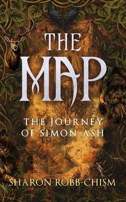
Welcome to the tangled underbrush of fantasy cover design, where The Map by Sharon Robb-Chism plants its flag, lights it on fire, and then forgets where it put the matches. If this cover is meant to be our guide through an epic journey, someone needs to call cartographic emergency services.
Let’s start with the title. “THE MAP” is written in a font that screams “I downloaded this from a medieval cosplay forum at 2 a.m.” The P, bless it, seems to have ambitions of becoming a scythe or a stylized fishing hook. Is it threatening the rest of the letters? Is it trying to escape? Only the designer knows. The subtitle, “The Journey of Simon Ash,” is slapped in underneath with all the personality of a default PowerPoint font. And there’s no cohesion. It’s as if two completely different design interns were assigned to the top and bottom halves of the title and never spoke to each other.
And speaking of halves, what even is going on in this jungle of unrelated elements? Front and centre (or, rather, back and everywhere) is what I presume is the map—a muddy parchment that’s being slowly devoured by aggressive vines. Not content with being merely confusing, the cover tosses in a majestic (yet floating) deer head, a pair of mysterious black wings that could belong to a fallen angel or a moulting crow, and a hidden creature peeking out from the bottom right corner like it’s hoping no one will notice it escaped from an AI fantasy art generator.
This thing is a full-blown Where’s Waldo of design sins. Every element is cut and pasted from a different Photoshop universe, with lighting, texture, and perspective left on the editing room floor. The animals look like they’re peering through time portals, stuck between a tabletop RPG manual and a Victorian hunting lodge painting.
And don’t even get me started on the colour palette. It’s brown on darker brown, with bonus green spaghetti vines wrapping everything like a garnish no one asked for. The overall aesthetic could best be described as Druidic basement clutter—if the basement was inside a haunted tavern.
At the end of the day, The Map doesn’t lead to adventure. It leads to confusion, overgrowth, and a few questionable typeface choices. If this is what the journey looks like, I’ll stay lost, thanks.
