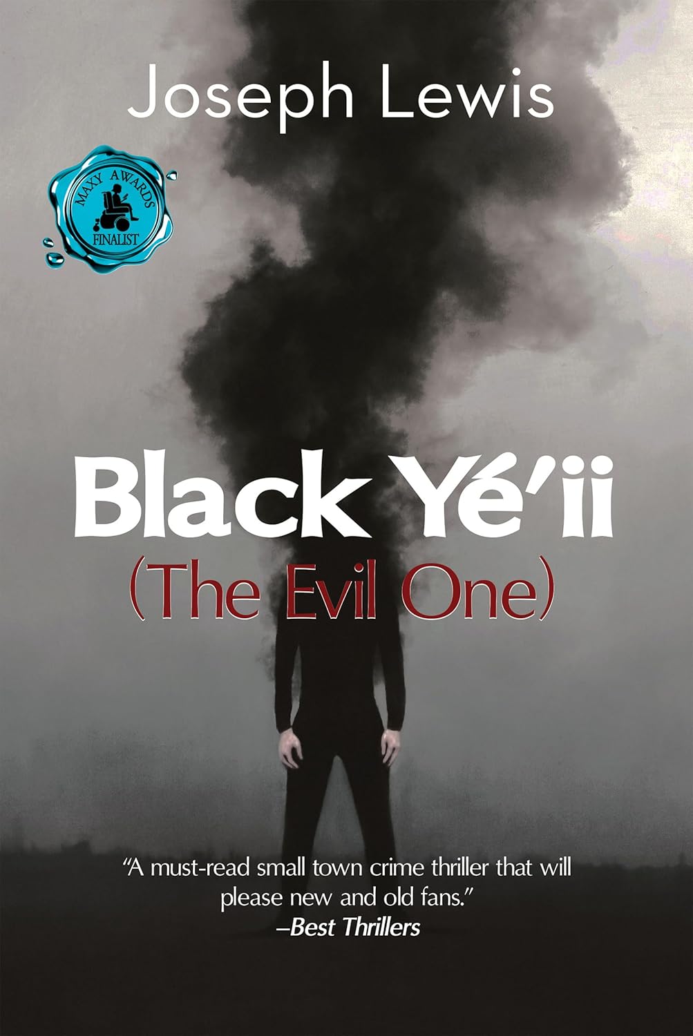
Welcome to the bleak, smoky world of Black Yé’ii, where evil lurks, mystery abounds, and fonts throw tantrums.
At first glance, you might think this is a moody indie film poster rejected by Netflix. But no – it’s a book cover. A real one. Designed by someone who seemingly used a haunted version of Microsoft Word 2003.
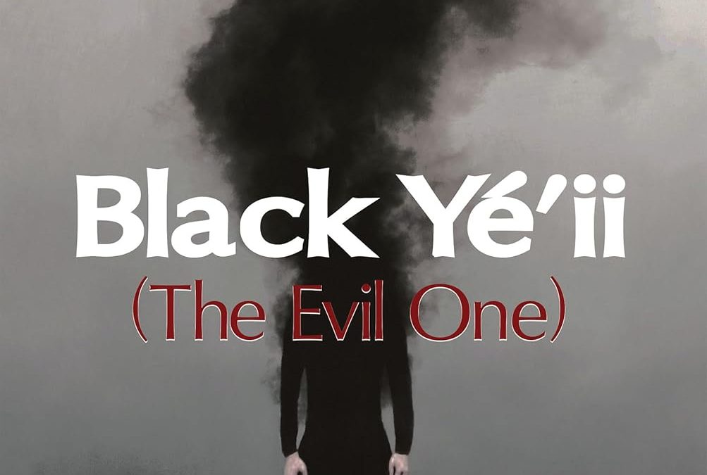
Let’s start with the focal point: a figure so shadowy and ambiguous, even their own reflection said, “Nah, I’m out.” Above them rises a plume of smoke – or is it a cloud of regret from Comic Sans’s dark cousin trying to rebrand?
The title “Black Yé’ii” (because of course it needs an apostrophe and diacritics) fights for attention with “(The Evil One)” in parentheses like it’s quietly excusing itself at a dinner party. Why is it in red? Why is it italicized? Why is it there?
Then there’s the enthusiastic quote at the bottom, declaring it a “must-read small town crime thriller.” Bold claim for a book cover that looks like it just failed a goth-themed Rorschach test.
And finally, the MAXY Awards badge – a teal medallion melting dramatically into the void like a sad wax seal on a cursed document.
This cover is many things: interpretive, chaotic, unintentionally hilarious. What it’s not is “final draft” ready. But hey – at least it’s unforgettable. Probably for the wrong reasons.

