“A regency romance that dares to ask: What if Photoshop were a musket?”
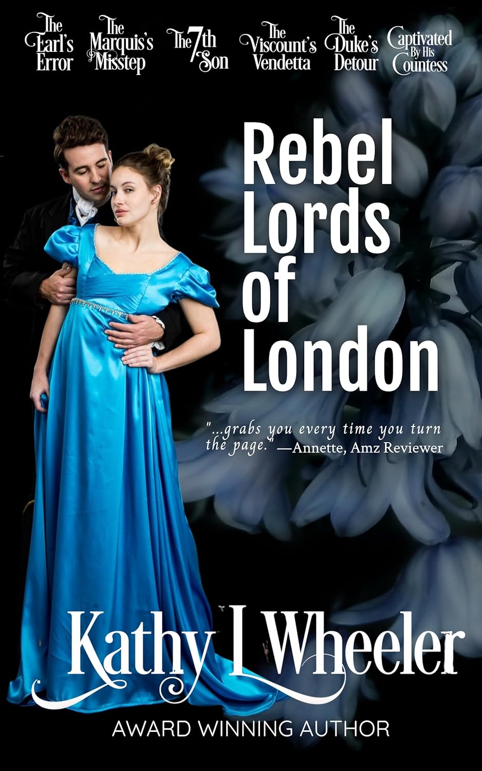
Welcome back, design masochists and genre enthusiasts! Today’s steaming carriage crash of a cover comes courtesy of Rebel Lords of London, a title that sounds like a BBC docuseries but looks like a poorly lit prom night in the middle of a flower shop fire sale.
Let’s start with the models, who appear to have been surgically extracted from a Sears Portrait Studio circa 1997. He’s gazing seductively (or sleepily) at her temple, and she’s giving full “I just remembered I left the oven on.” The chemistry between them is less “scandalous affair” and more “posed together for grandma’s Christmas card.”
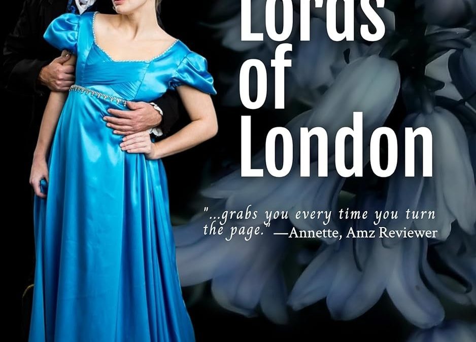
Now let’s talk about that dress. It’s blue. Bright blue. Unnaturally, retina-searingly blue. The kind of blue you see on discount bridesmaid dresses or superhero sidekicks. It’s like the designer shouted, “Make her look noble!” and the illustrator heard, “Dip her in Gatorade.”
The background features… what exactly? A cryptic cloud of blurry lilies or possibly underexposed cabbages. Either way, it’s a stark contrast to our flatly lit lovebirds, making the whole cover feel like a bad cut-and-paste job from three separate time periods.
Let’s not ignore the title typography, which commits to nothing. “Rebel Lords of London” is in bold, clean sans-serif — more Jason Bourne than Jane Austen — while the author’s name is scrawled in a flourishy font that screams, “We paid extra for this tail on the ‘L.’” The top row of titles for other books in the series floats overhead like confused subtitles: The Earl’s Error, The Viscount’s Vendetta, The Duke’s Detour. It’s less an anthology and more a roll call at a peerage-themed improv class.
And that review quote?
“…grabs you every time you turn the page.” — Annette, Amz Reviewer
Annette, wherever you are, blink twice if you were coerced.
Final Verdict:
A genre mashup of Regency Romance, PowerPoint 2004, and local haunted wax museum. We don’t know who the rebel is, but we hope he revolts against this layout.

