“Welcome to the uncanny valley of cover design. Population: this.”
Friends, readers, and graphic design survivors, today’s entry in Horrible Covers is less a book cover and more an encrypted psychic message from a dimension where fonts have given up and visuals have legally declared themselves abstract expressionism.
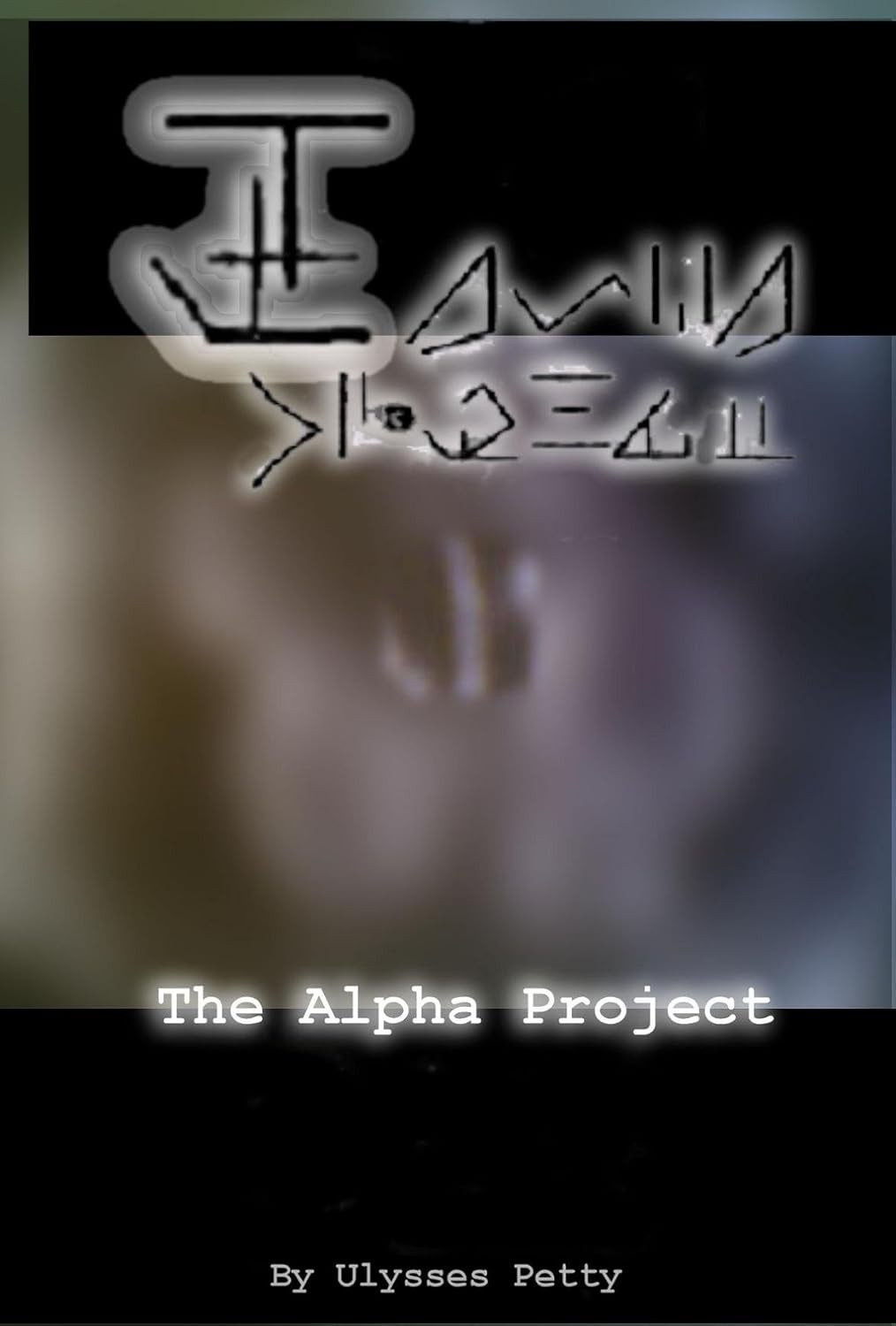
Let us now gaze upon The Alpha Project by Ulysses Petty — a title that dares to ask: What if we wrapped a sci-fi thriller in a mystery burrito made of visual static and spray-painted cryptograms?
First, the glyphs. These symbols — surely drawn with a mouse on a caffeine drip — appear to be an alien alphabet, or possibly just Wi-Fi passwords from alternate timelines. They’re glowing. They’re edgy. They scream “secret society” or maybe “middle school pencil case doodles that got a little too intense.” Their purpose? Unknown. Their aesthetic value? Also unknown.
Beneath this abstract techno-sigil lies the blurred horror zone, also known as the “background.” Is it a face? A spirit? A melted stormtrooper mask? We may never know, because the resolution is so low it could legally qualify as visual soup. You could stare at this for hours and see either divine meaning or a Rorschach test gone rogue.
And then, we’re suddenly grounded by the phrase “The Alpha Project.” Finally, words! But they’re delivered in a font so neutral it’s practically clinical. The stark white monospaced type, complete with glowing edges, feels like it’s been extracted from a Cold War filing cabinet or the first screen of a Y2K survival game.
Finally, in the lower abyss, we get “By Ulysses Petty” in the ever-iconic “default typewriter font.” It looks like it was slapped on during a ten-second formatting panic. It doesn’t say “author.” It says “prisoner of this project.”
Final Verdict:
A cover that’s either a bold statement on dystopian aesthetics… or the result of someone Googling “free design software” five minutes before the deadline. Either way, it’s a Horrible Cover hero. We salute your commitment to chaos, Mr. Petty.

