Oh, Hobtown. We love you, we truly do — but we also don’t understand you. And we’re pretty sure your mystery stories are cooked in the same pot where folklore and fashion mistakes go to ferment.
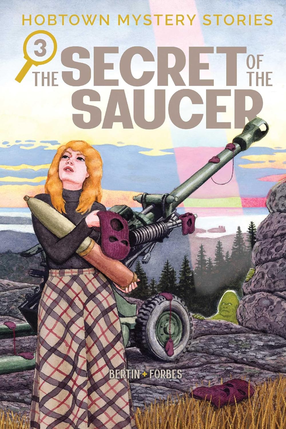
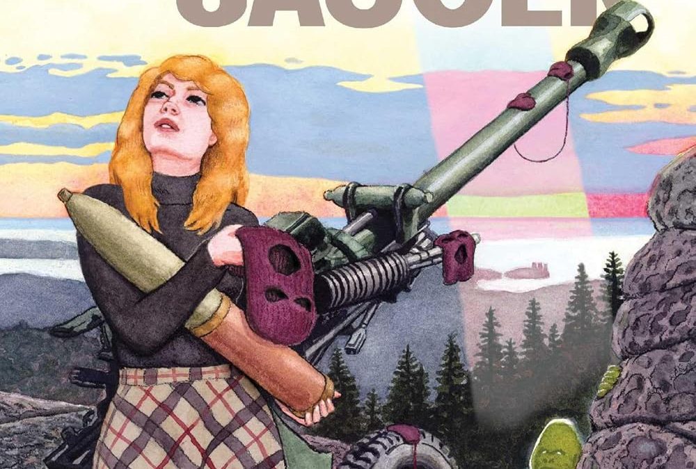
This cover is doing… a lot. Let’s start with our heroine, who appears to be wistfully daydreaming about algebra homework while clutching a bazooka with what can only be described as romantic tension. Is she guarding the Canadian wilderness? About to fire on a suspiciously lime-colored gravestone? Or just modeling 1970s woodsy couture with a vengeance? It’s unclear.
Meanwhile, the color palette seems to have been pulled from a mid-century fabric swatch book and a radioactive pond at the same time. Those shades of mauve, peach, and bile green weren’t meant to coexist — and yet, here they are, peacefully clashing under a psychedelic sky that screams alien encounter or failed watercolor class?
And we can’t ignore the font choices: three different sizes, inconsistent weights, and a magnifying glass just in case you missed the clue that this is, in fact, a mystery. It’s like the cover designer was abducted mid-project and replaced by a high school zine editor from 1974.
Verdict: Somewhere between Scooby-Doo and an art therapy session gone rogue, this cover is unforgettable — but not for the reasons you want. We’ll keep reading, but only after we finish processing the trauma of that tartan skirt.

